-
DATA
2016/04
-
CLIENT
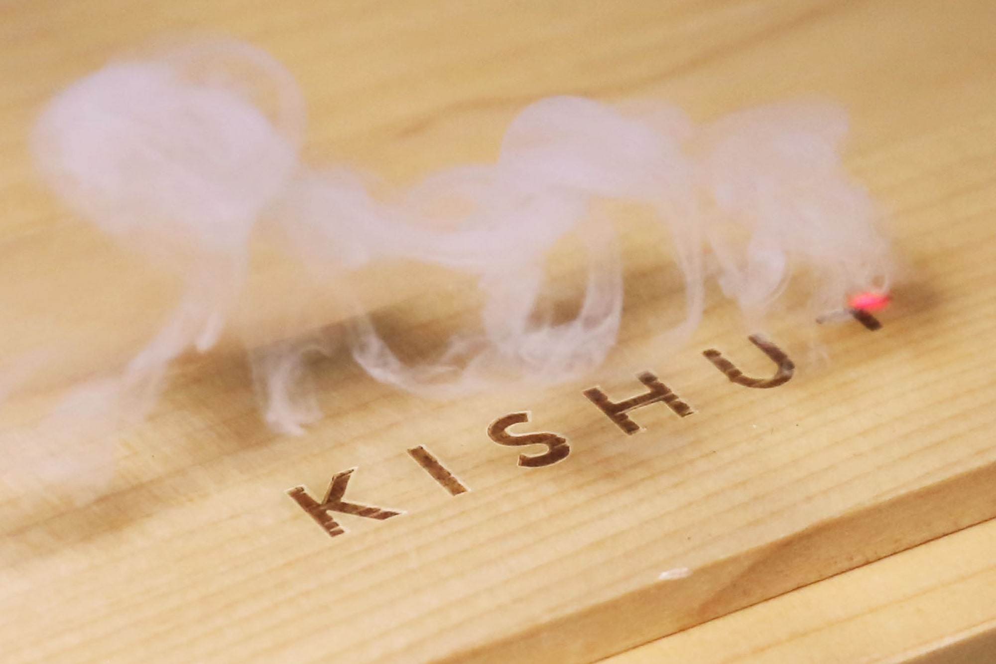
KISHU+
-
PROJECT NAME
KISHU+
PHOTO
Masayuki Hayashi
※Except venue and work in progress photos.LINK
Collaborate
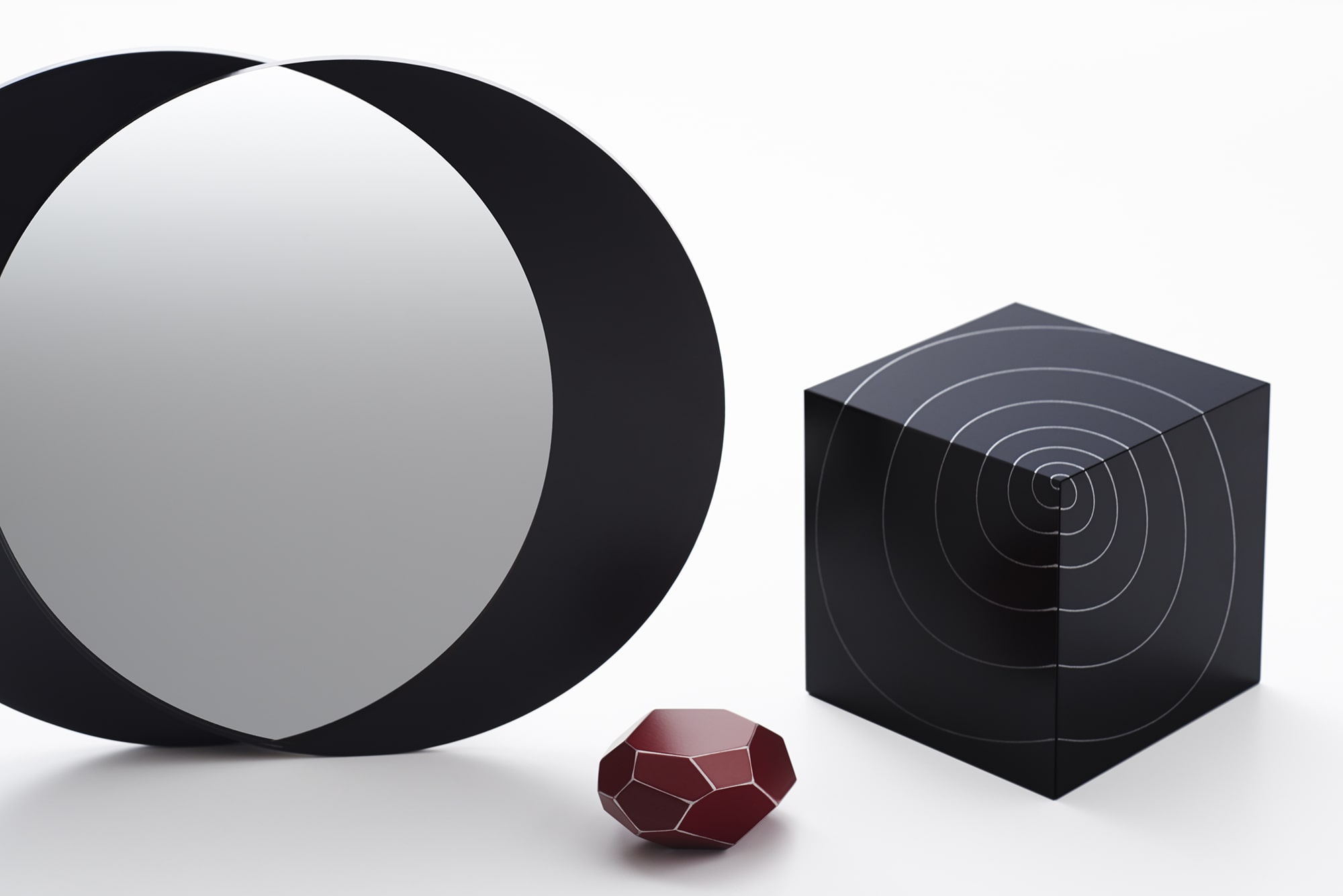
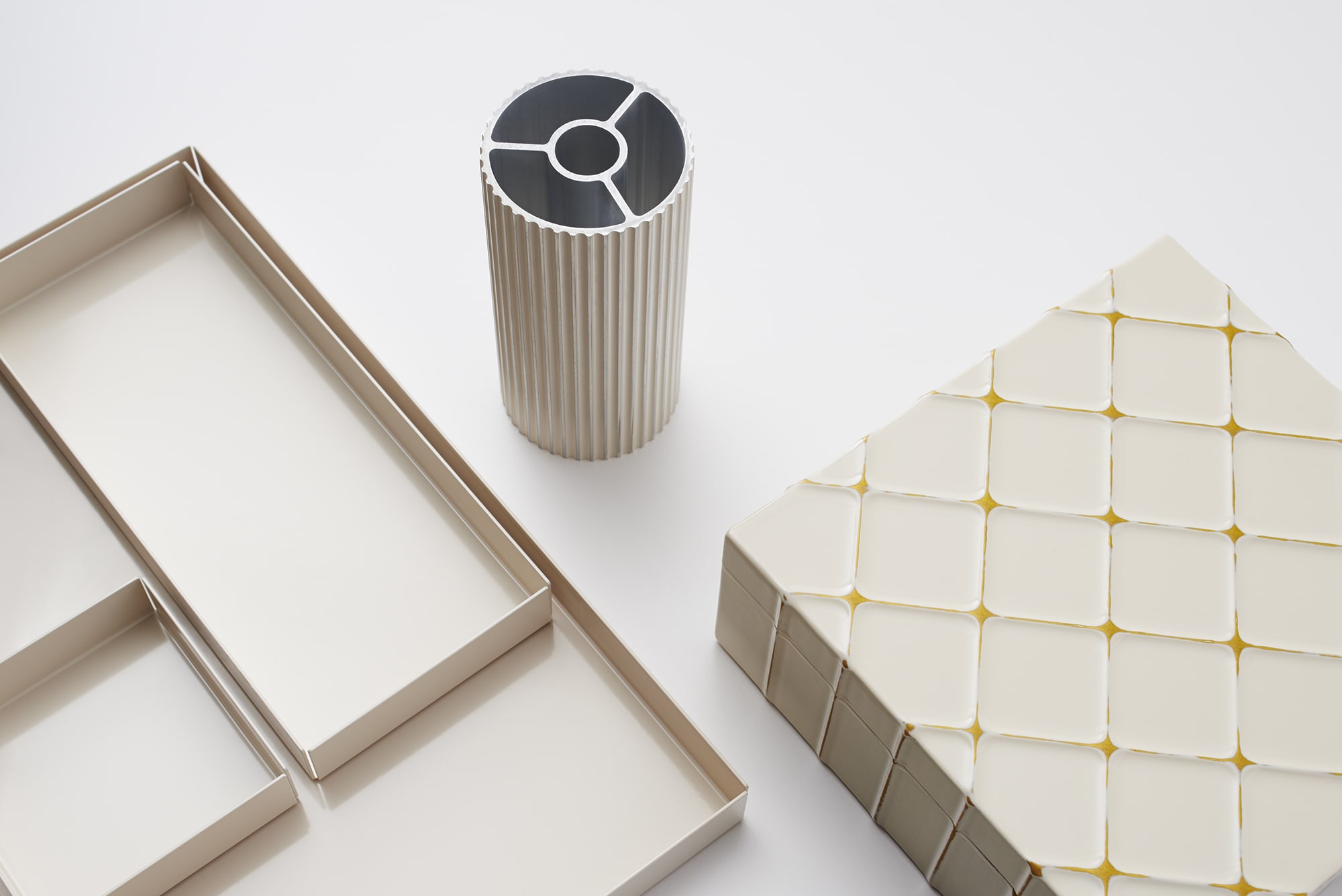
Craftsmanship and modern technology.
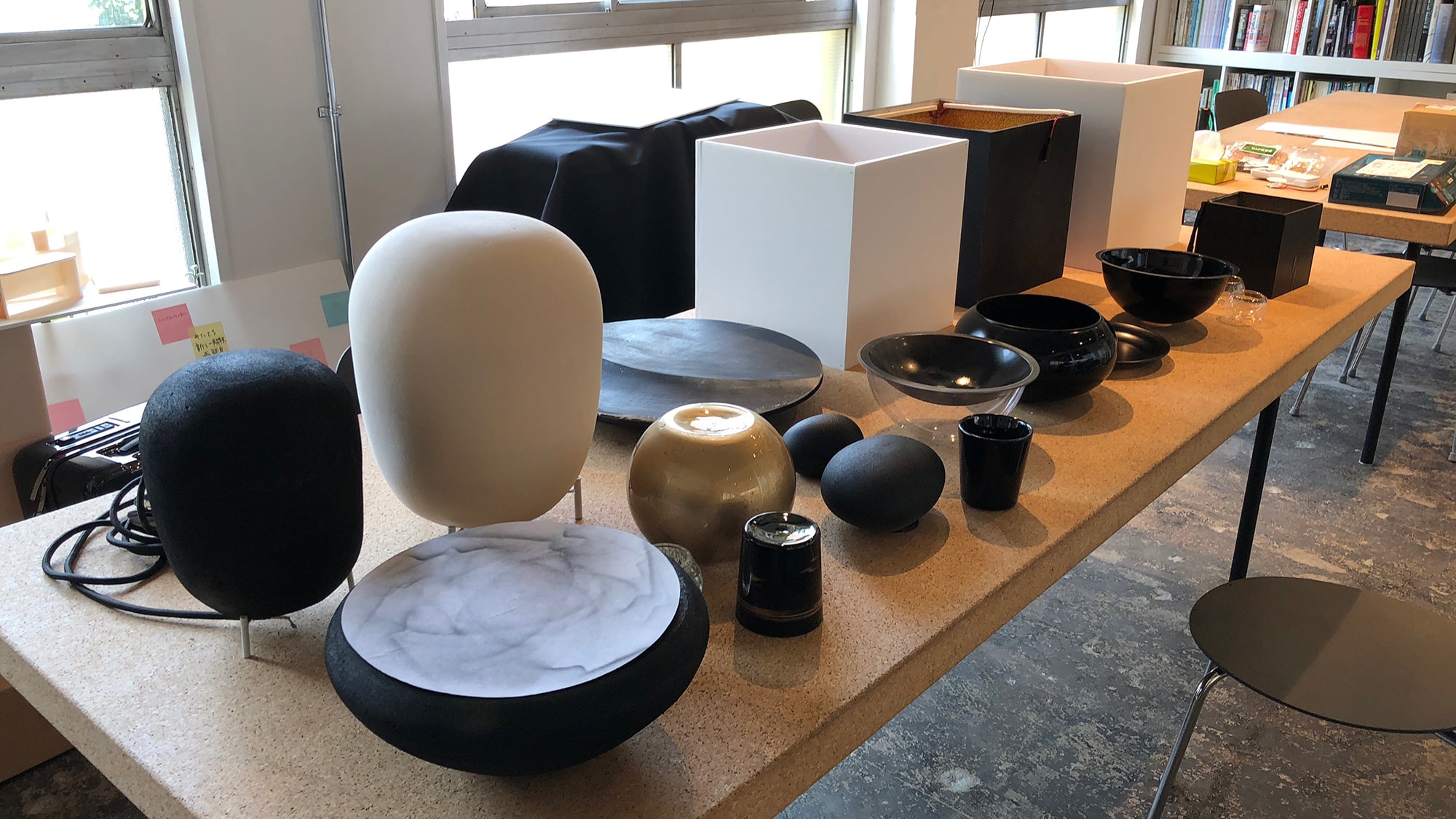
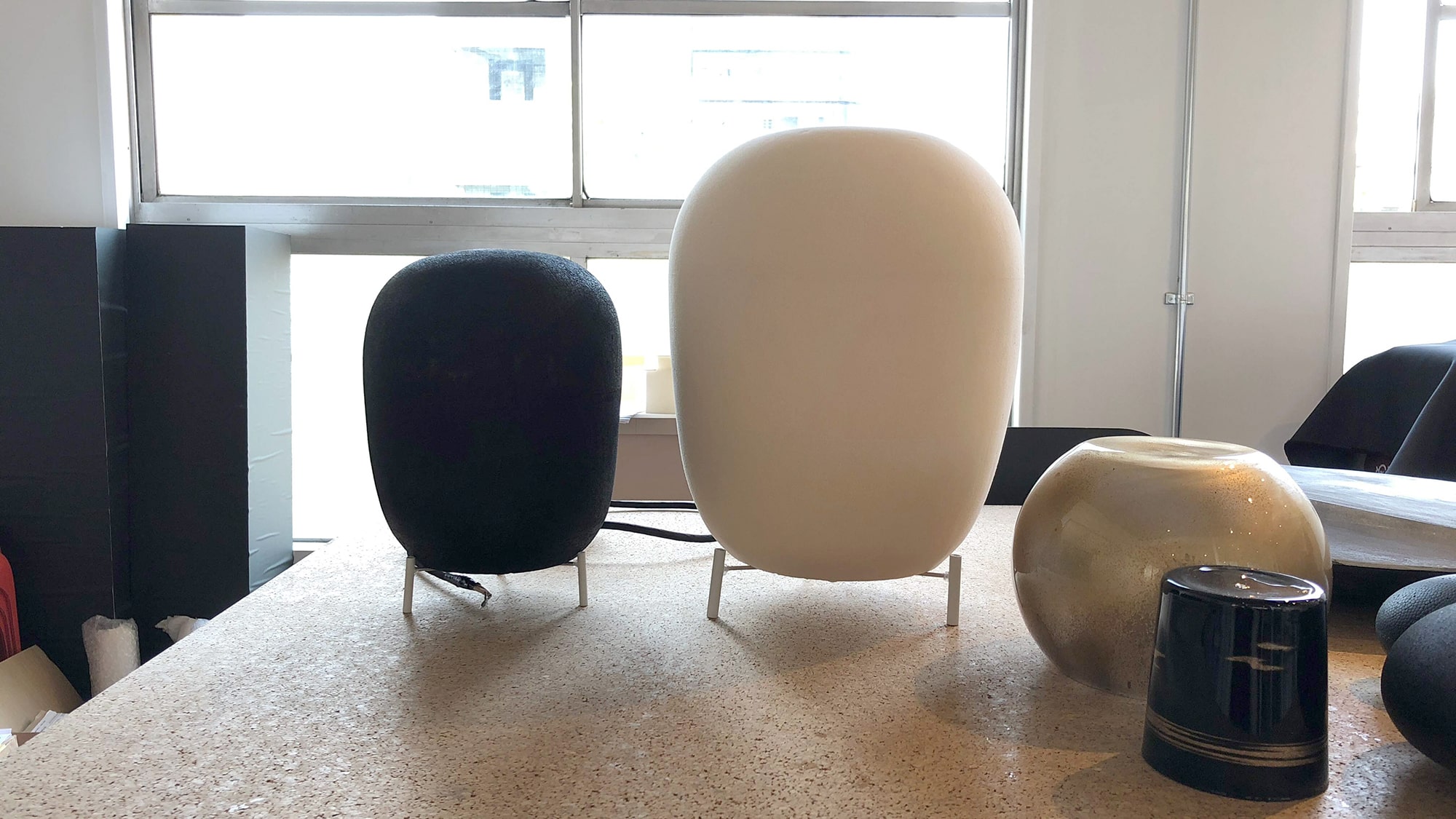
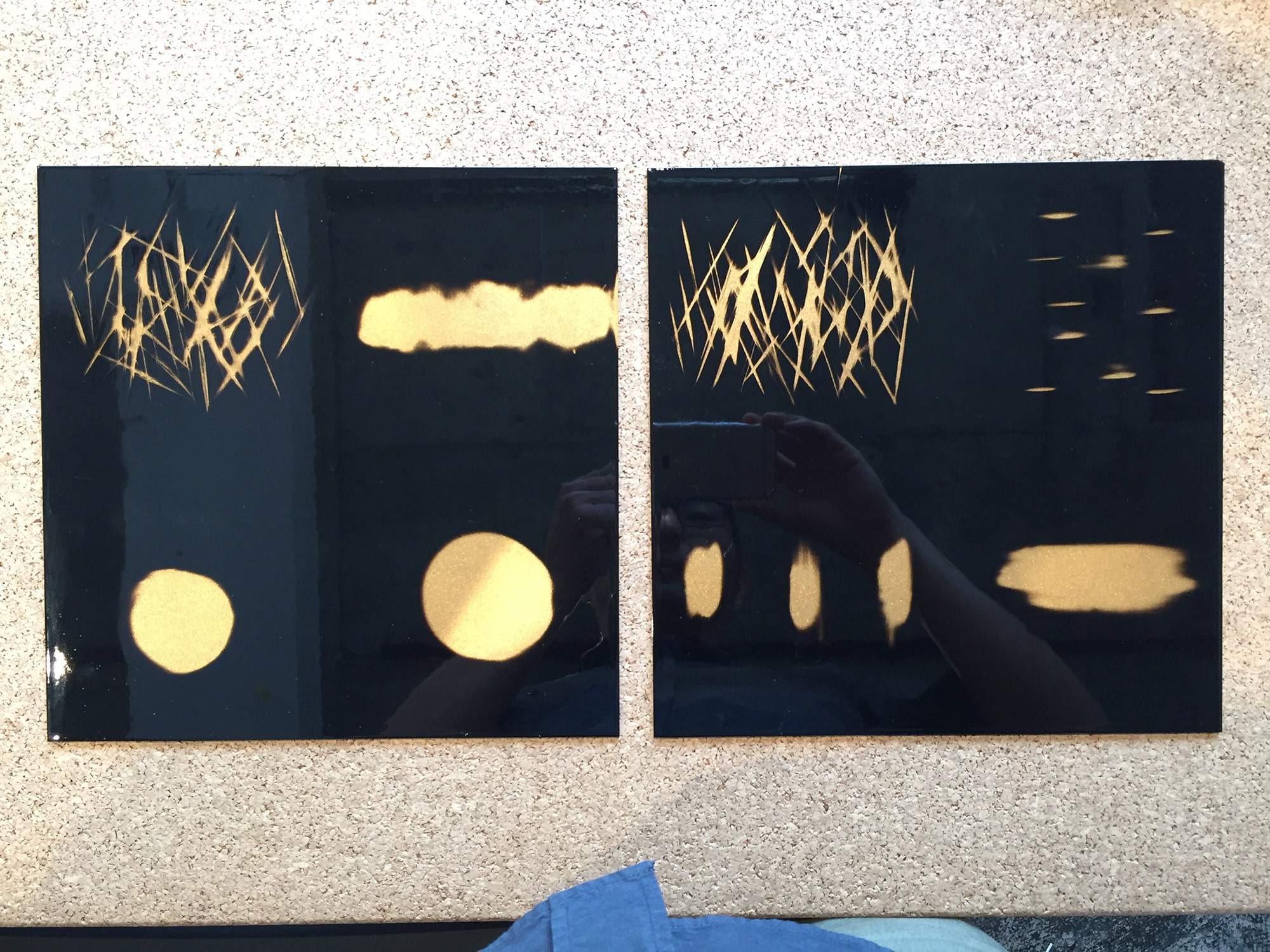
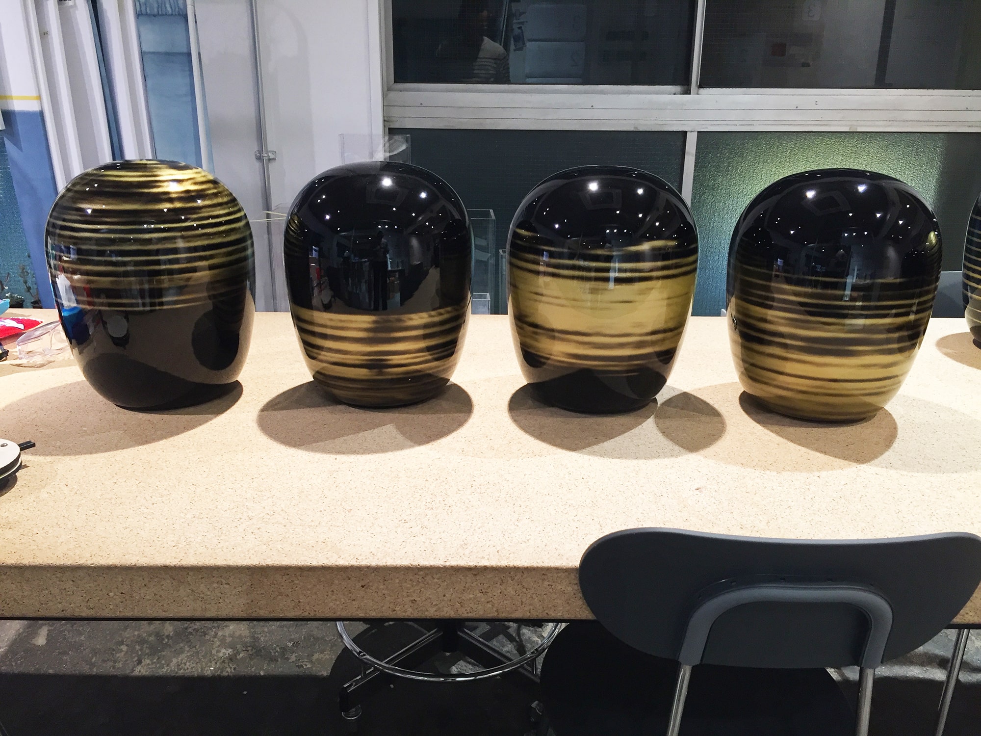
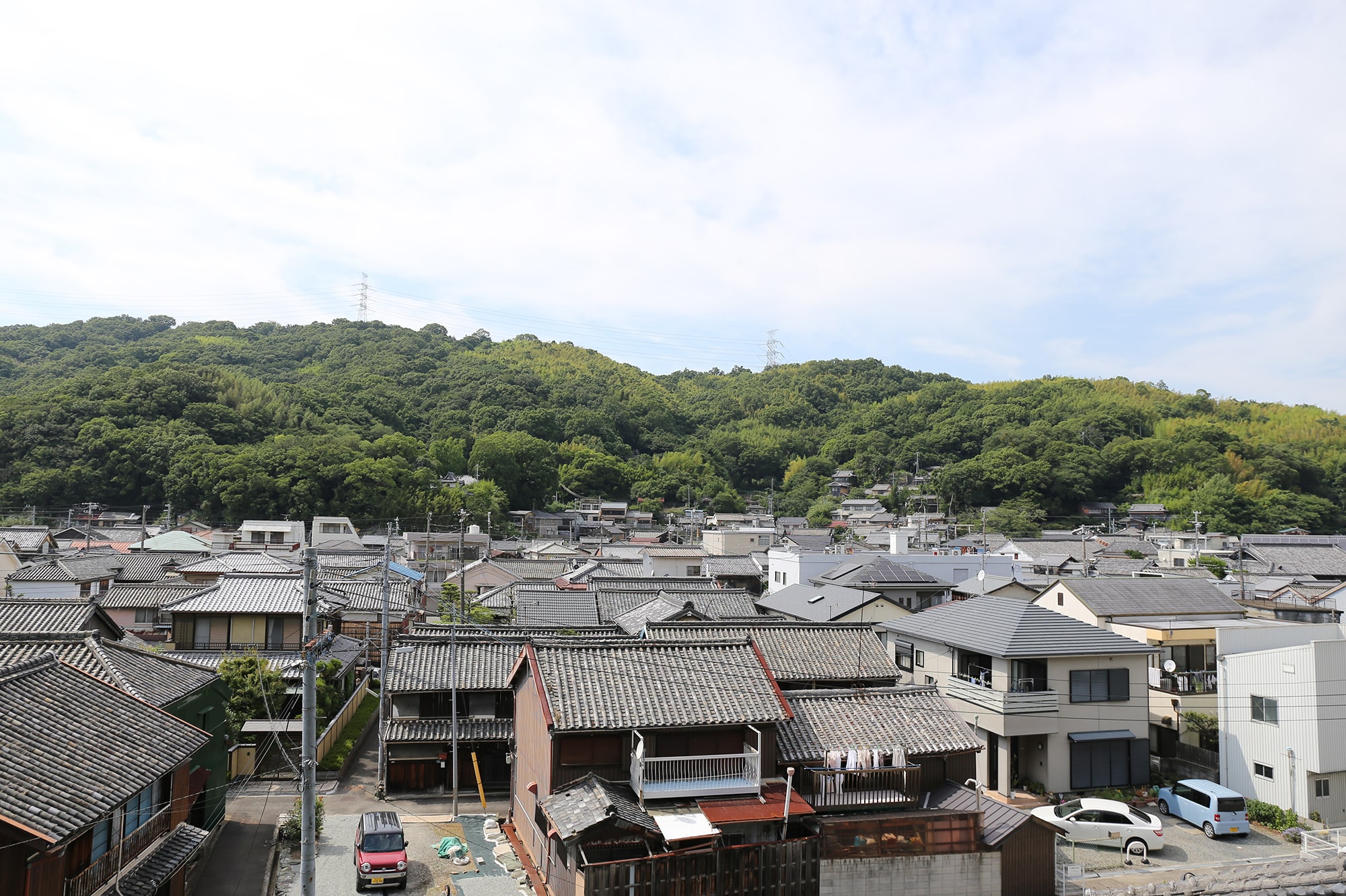
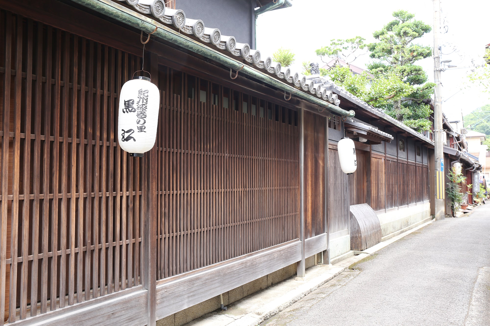
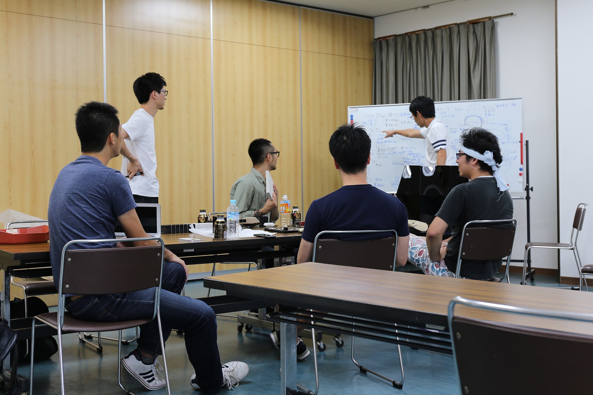
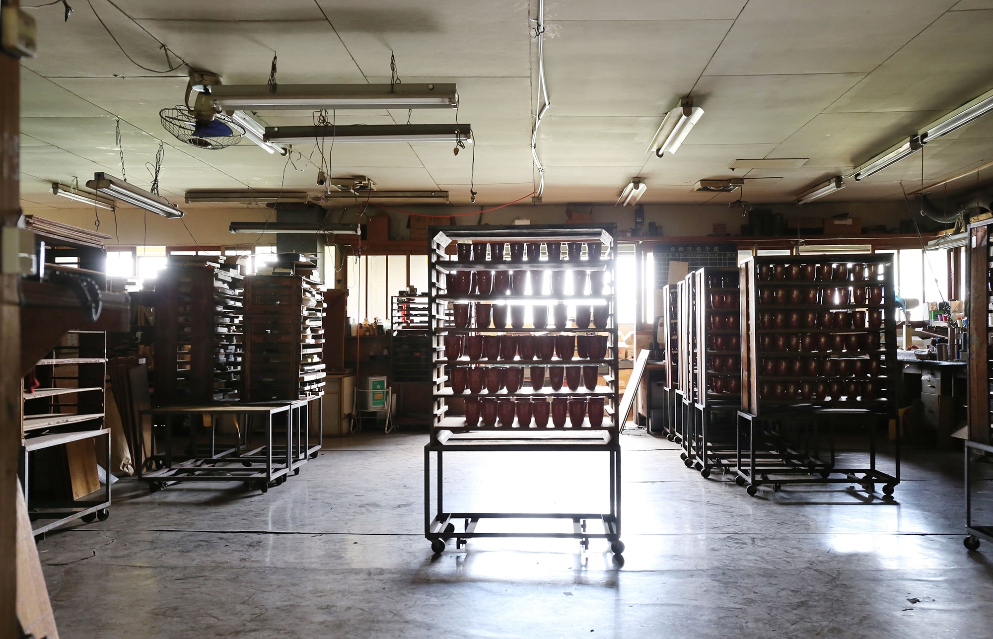
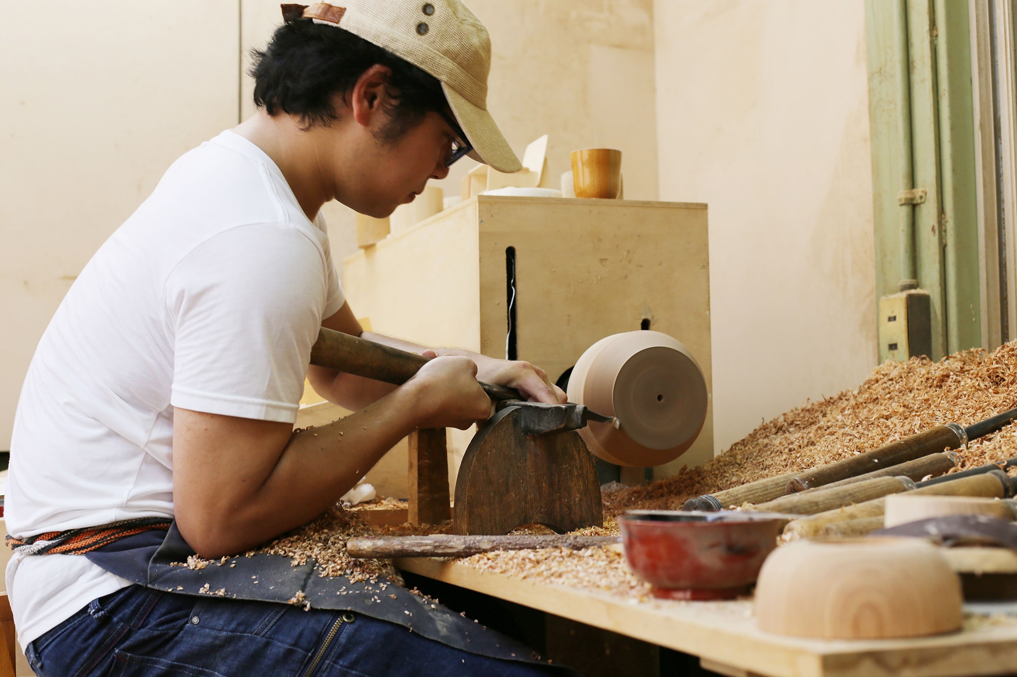
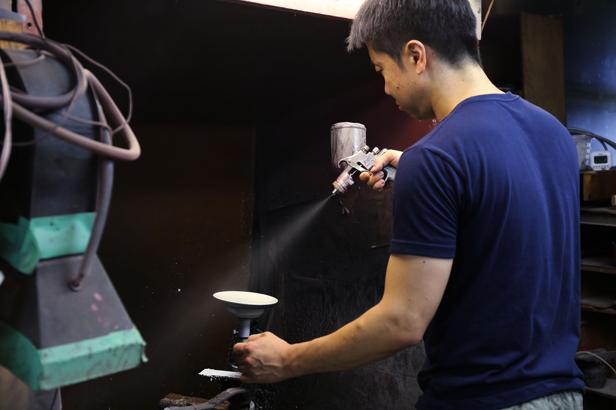
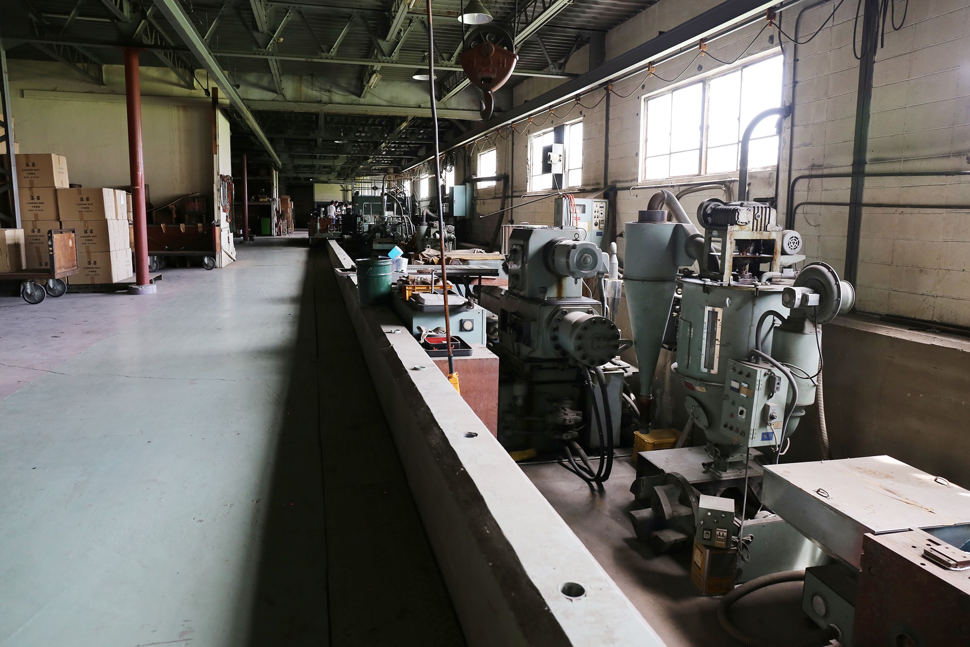
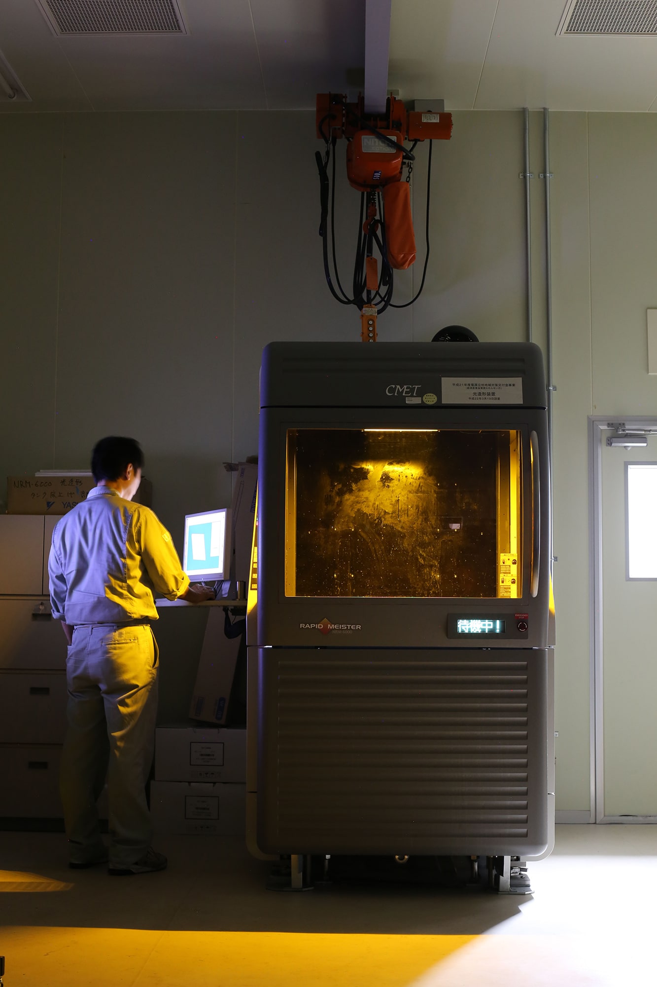
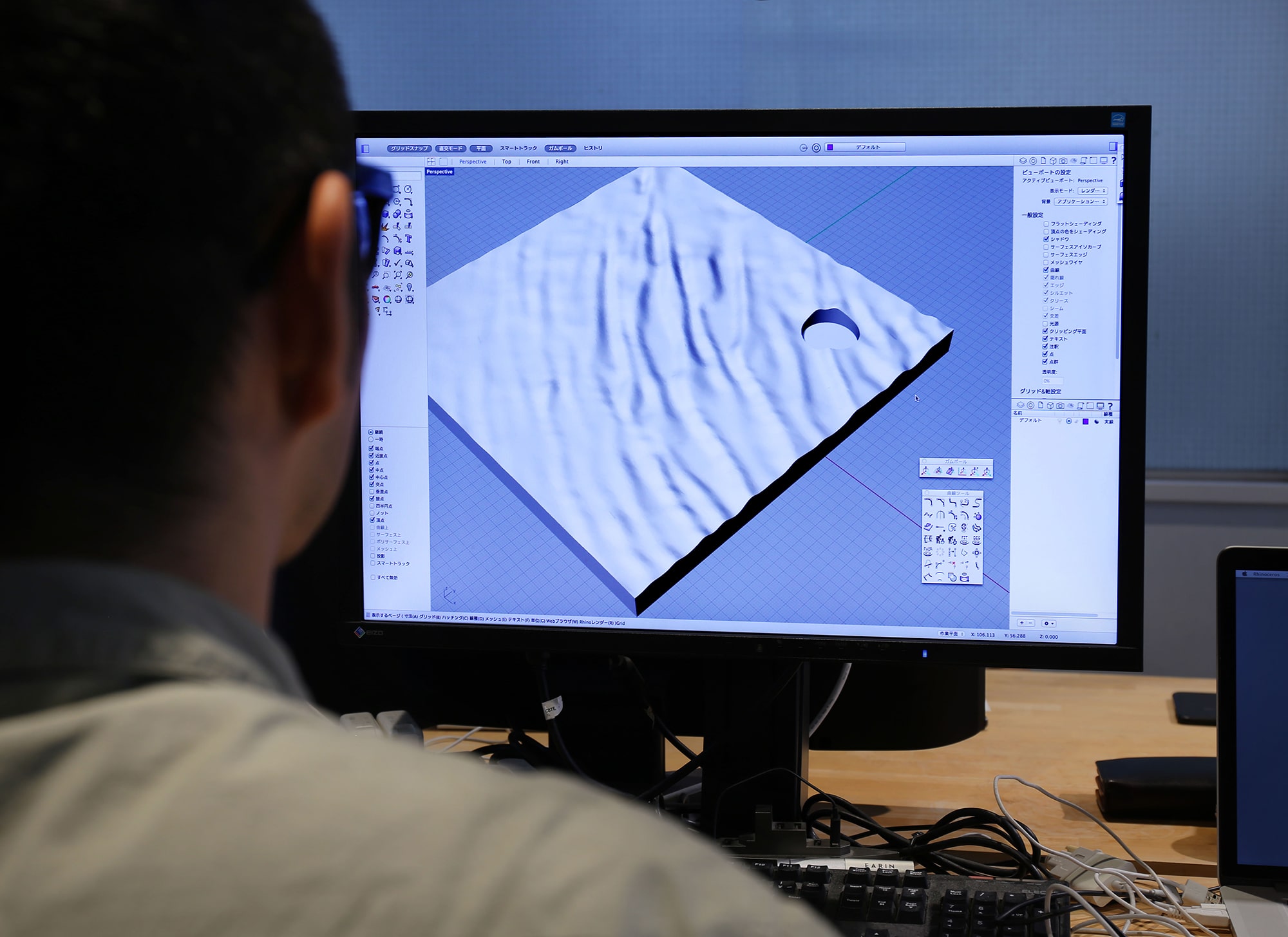
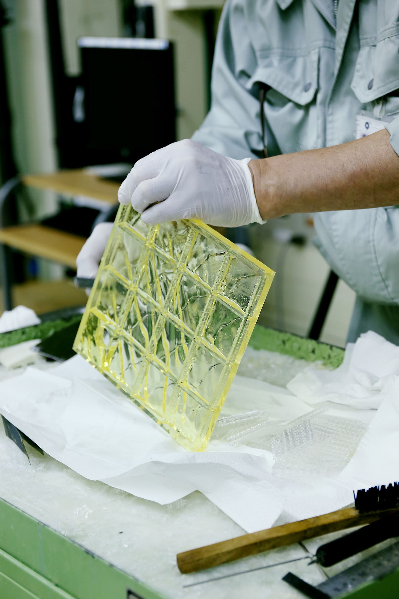
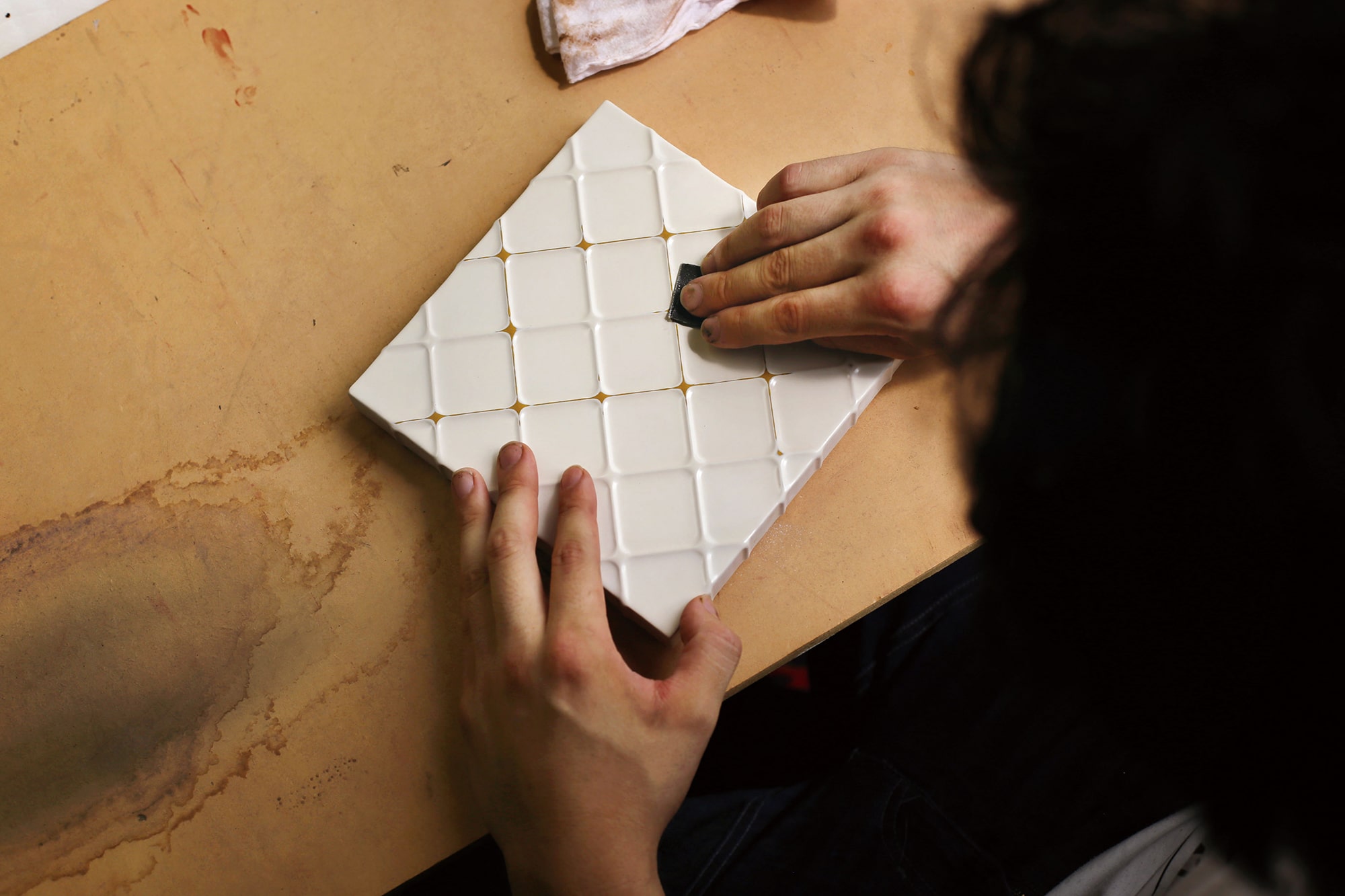
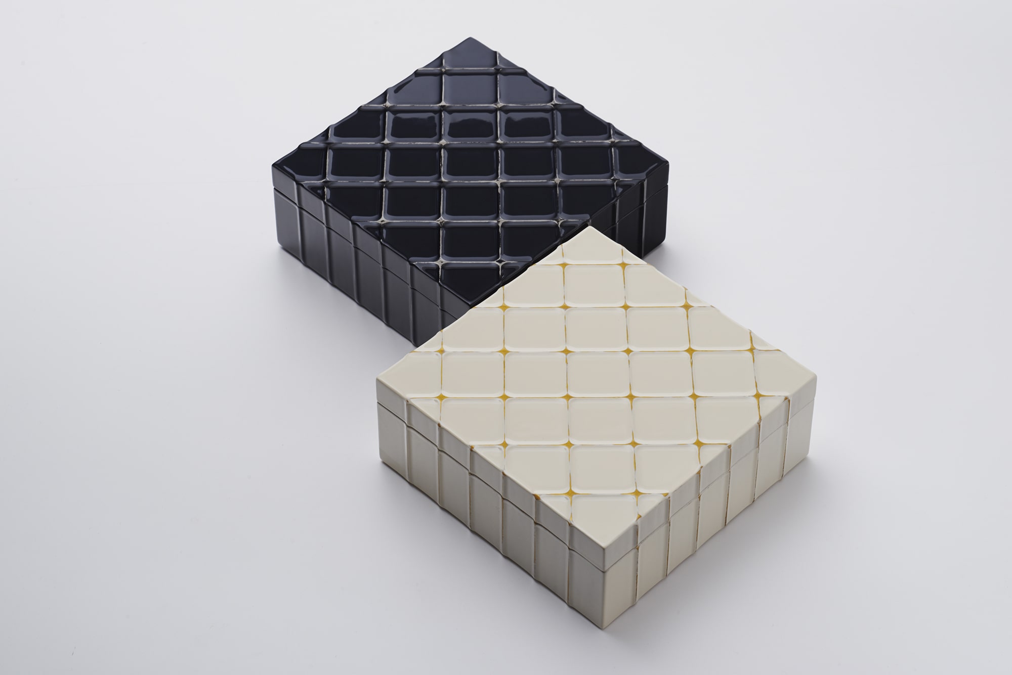
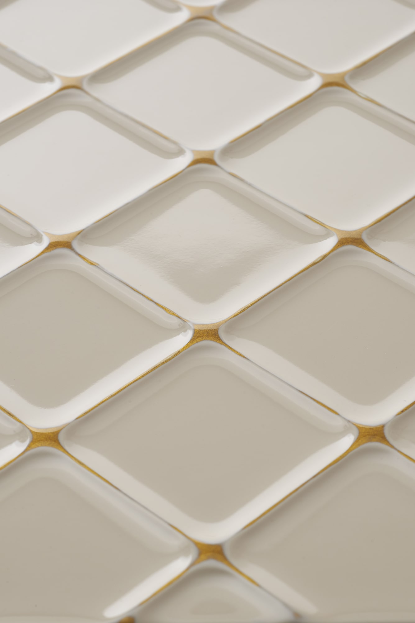
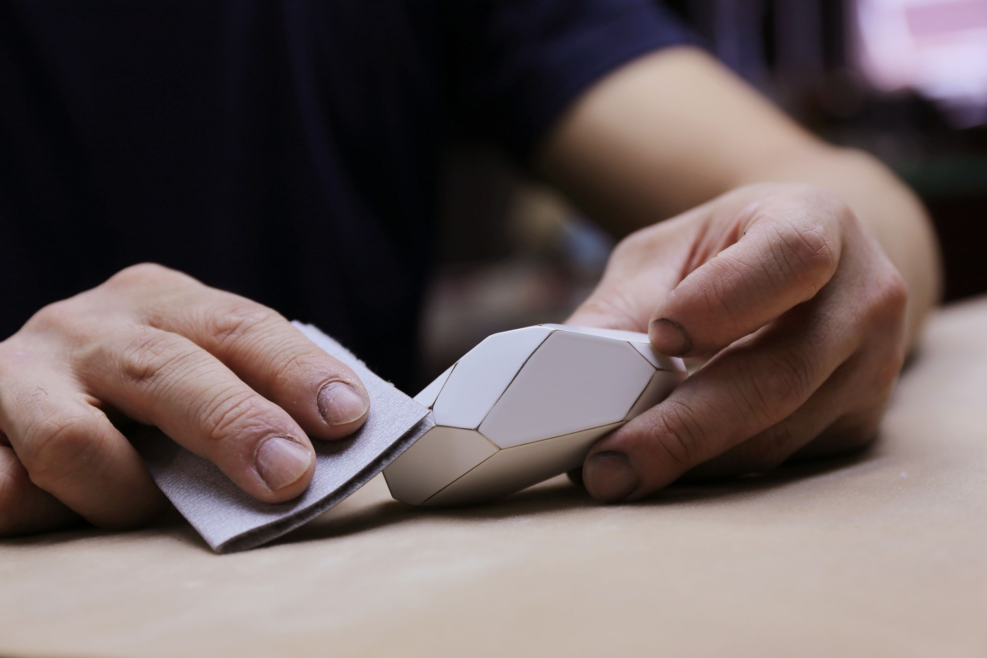
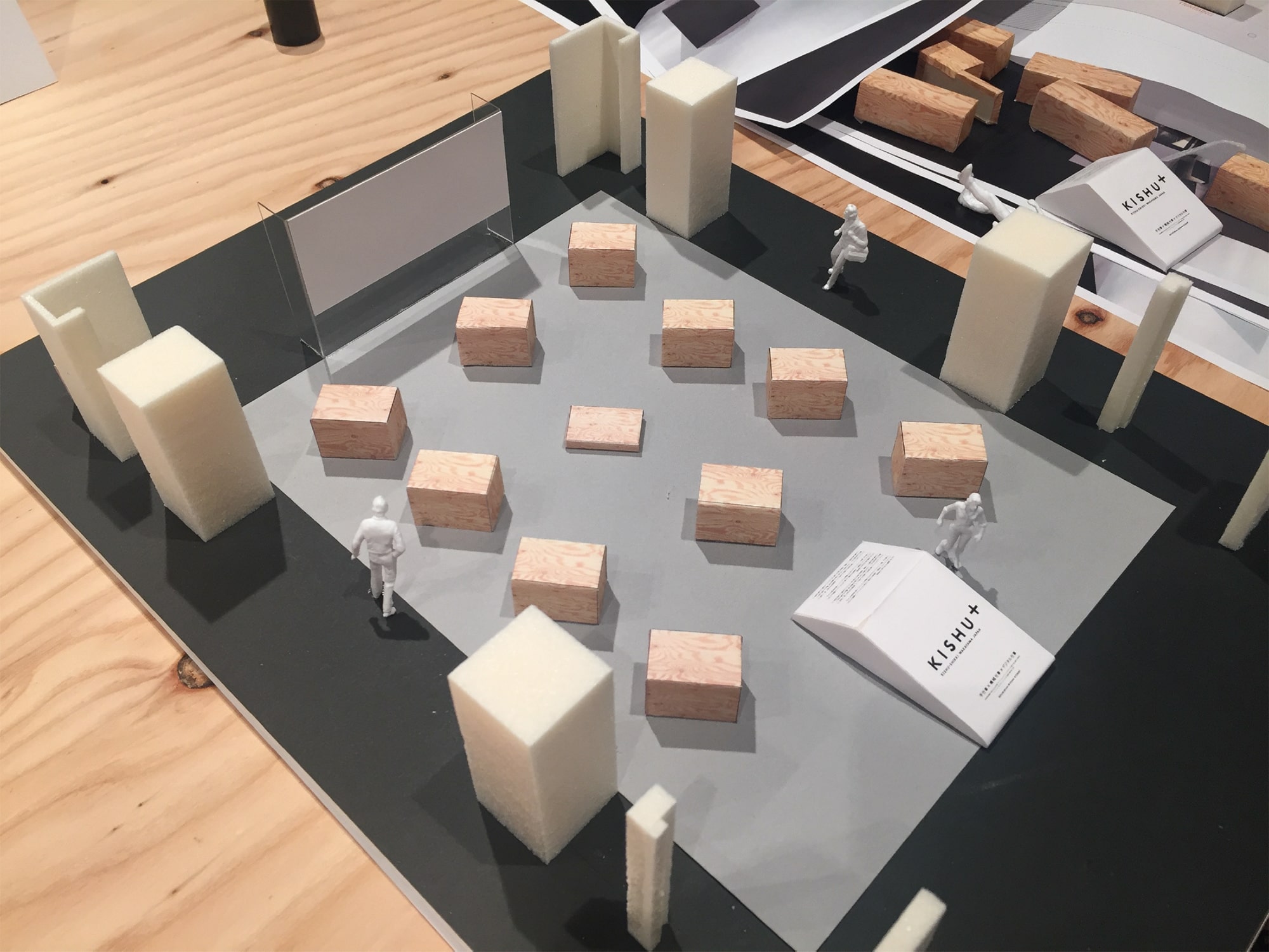
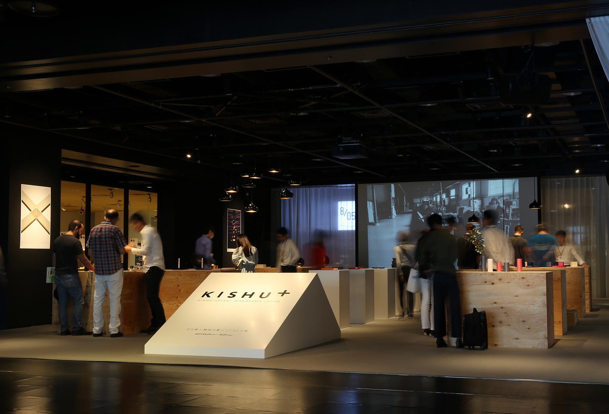
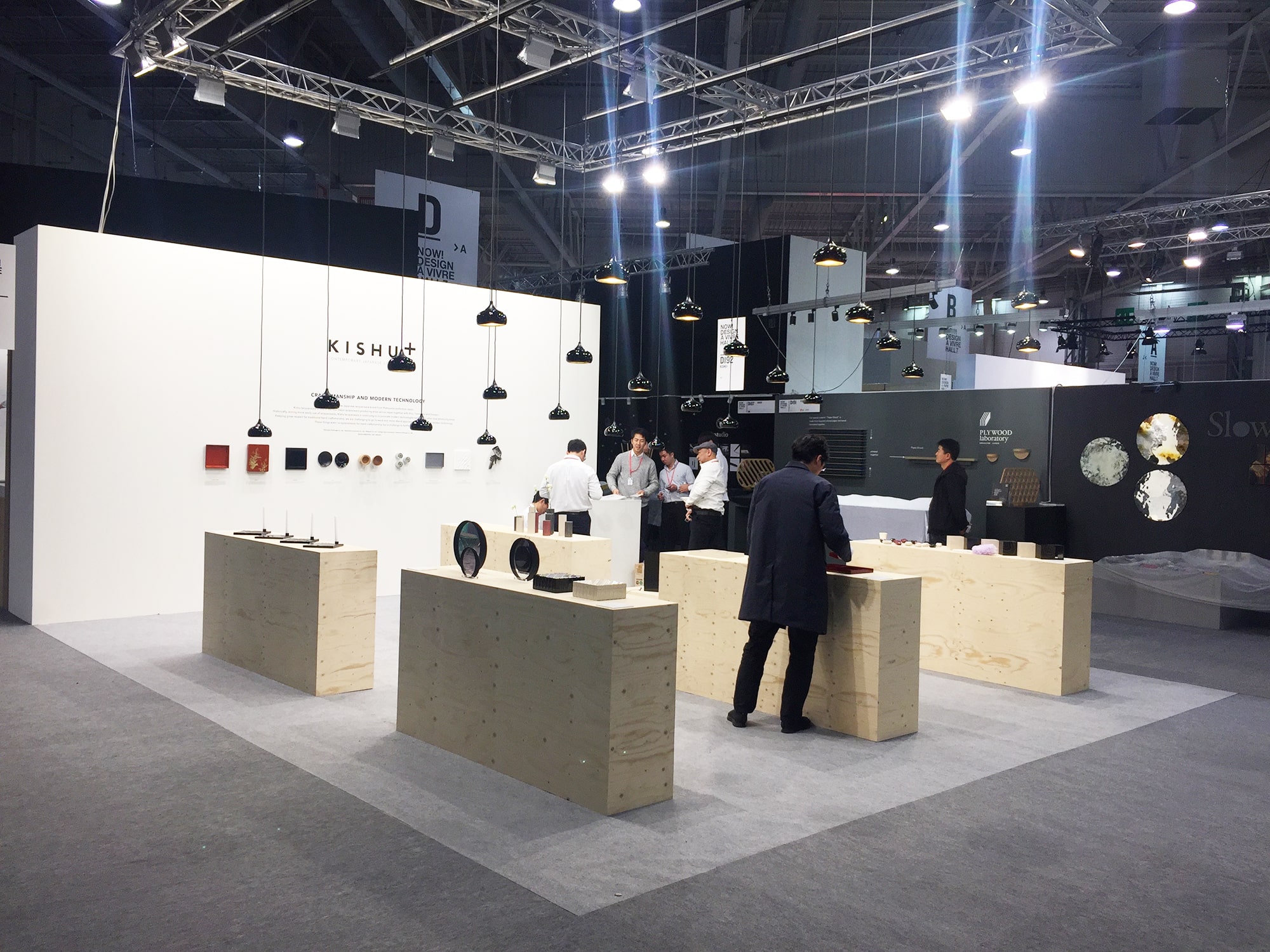
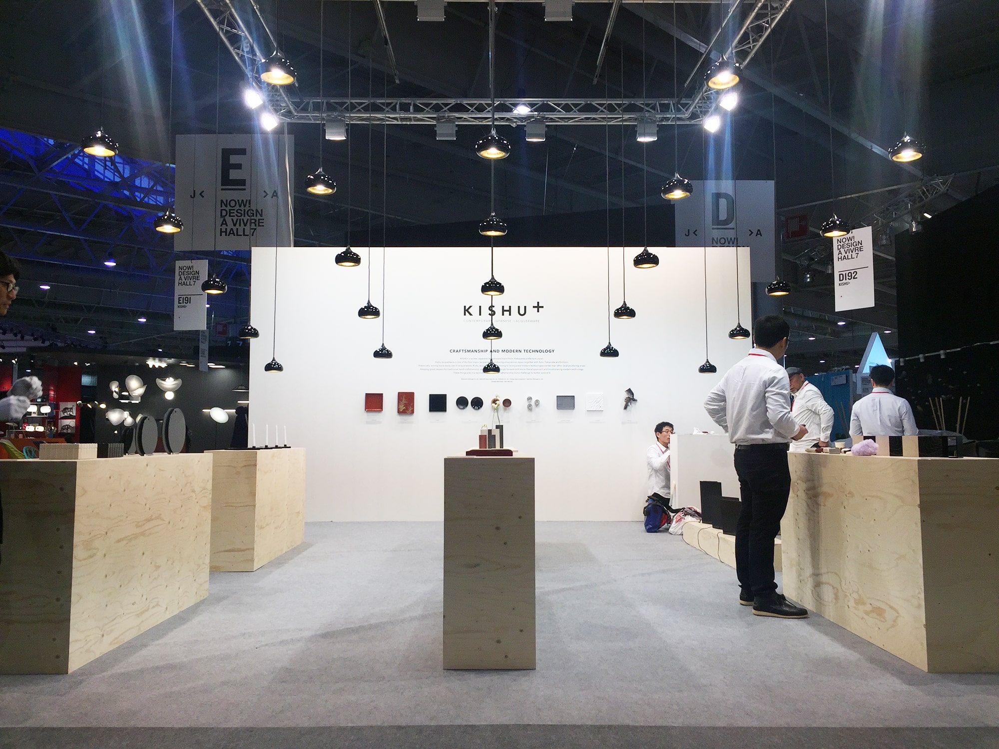
KISHU+ is a new brand of lacquerware, launched by five companies in the Kishu lacquerware production area. TAKT PROJECT provided the overall design direction, from project concept to product design, brand design, etc. Originating in the Muromachi period (1336-1573), Kishu lacquerware is one of the four major lacquerware production areas in Japan, along with Aizu, Yamanaka, and Echizen. In pursuit of lacquerware for casual use, Kishu producers were among the first to introduce new techniques such as synthetic lacquer and resin bases, and their flexible approach has brought in a fresh breeze to the lacquerware industry. The introduction of new techniques led to increased productivity and originally met market demand, but the market demand has gradually changed. Competing casual wares, including imported ones, are low-cost and have saturated the market. Therefore, we proposed that they seek value that can only be created by the fusion of technology and craftsmanship, while maintaining a liberal attitude towards technology. It is not a substitute for craftsmanship. “What can we do by introducing digital manufacturing technology?” “What can be done by combining machine processing?” With these questions in mind, the goal of this project was “advanced craft.” By incorporating new technologies and further expanding the skills and expressions that have been cultivated over the years, this project sought an expression that cannot be achieved by handwork alone or industrial production alone. 3D printers, uncommon materials, and design through digital simulations have been introduced. By combining these with the traditional lacquerware techniques, different values of the lacquerware itself were rediscovered.
As the first step, 15 prototype products were produced, some of which have been commercialized and exhibited at the Maison&Objet Paris, the world’s leading interior and design trade fair.
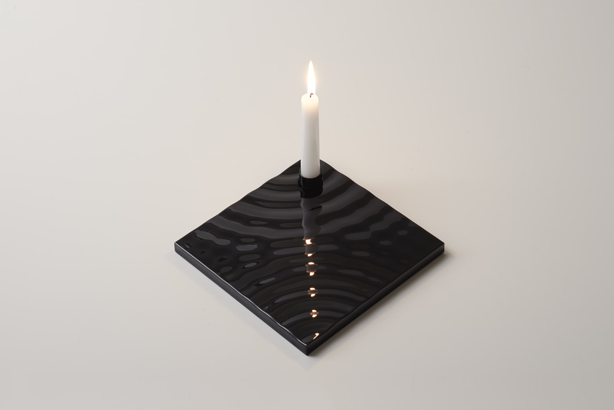

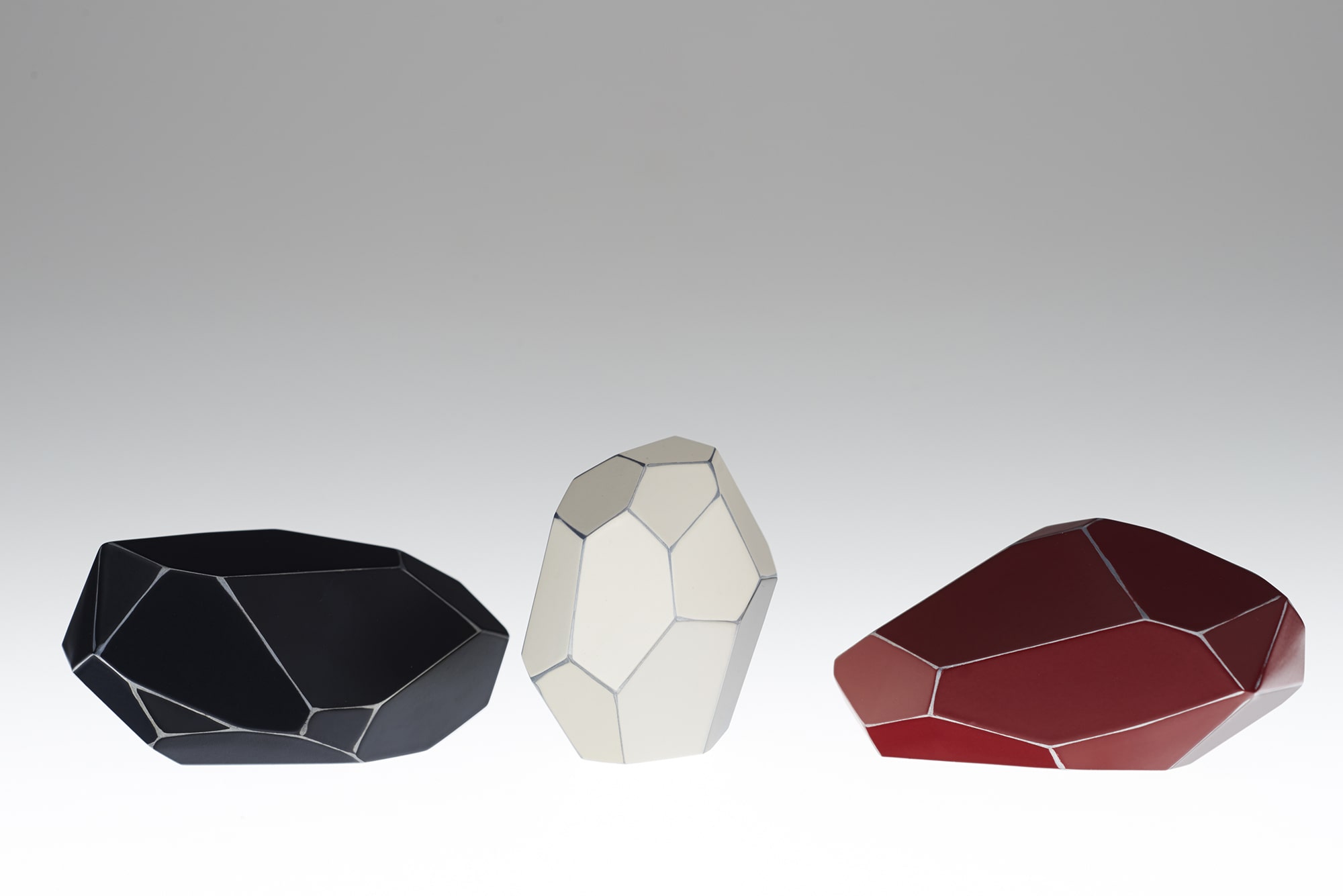
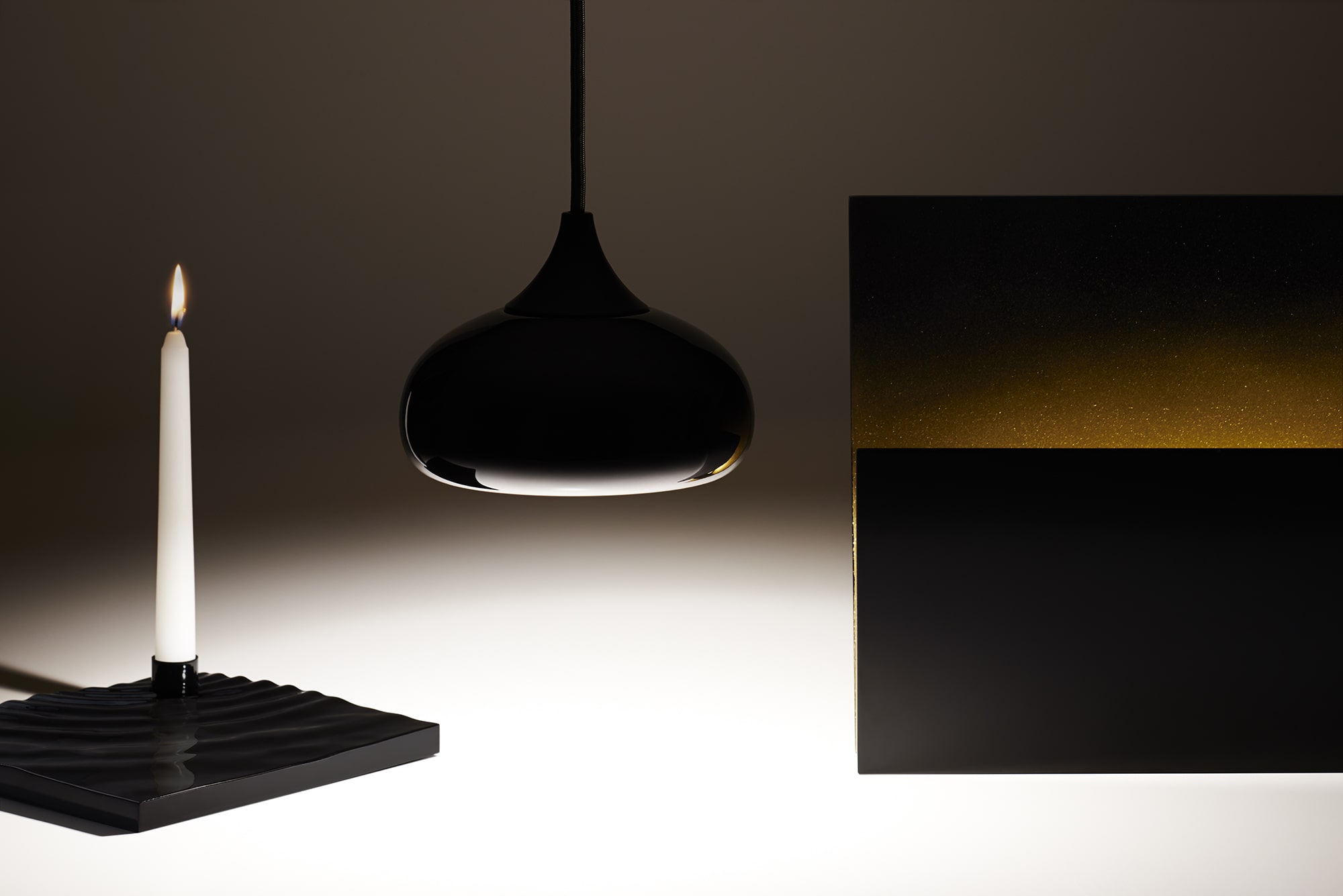
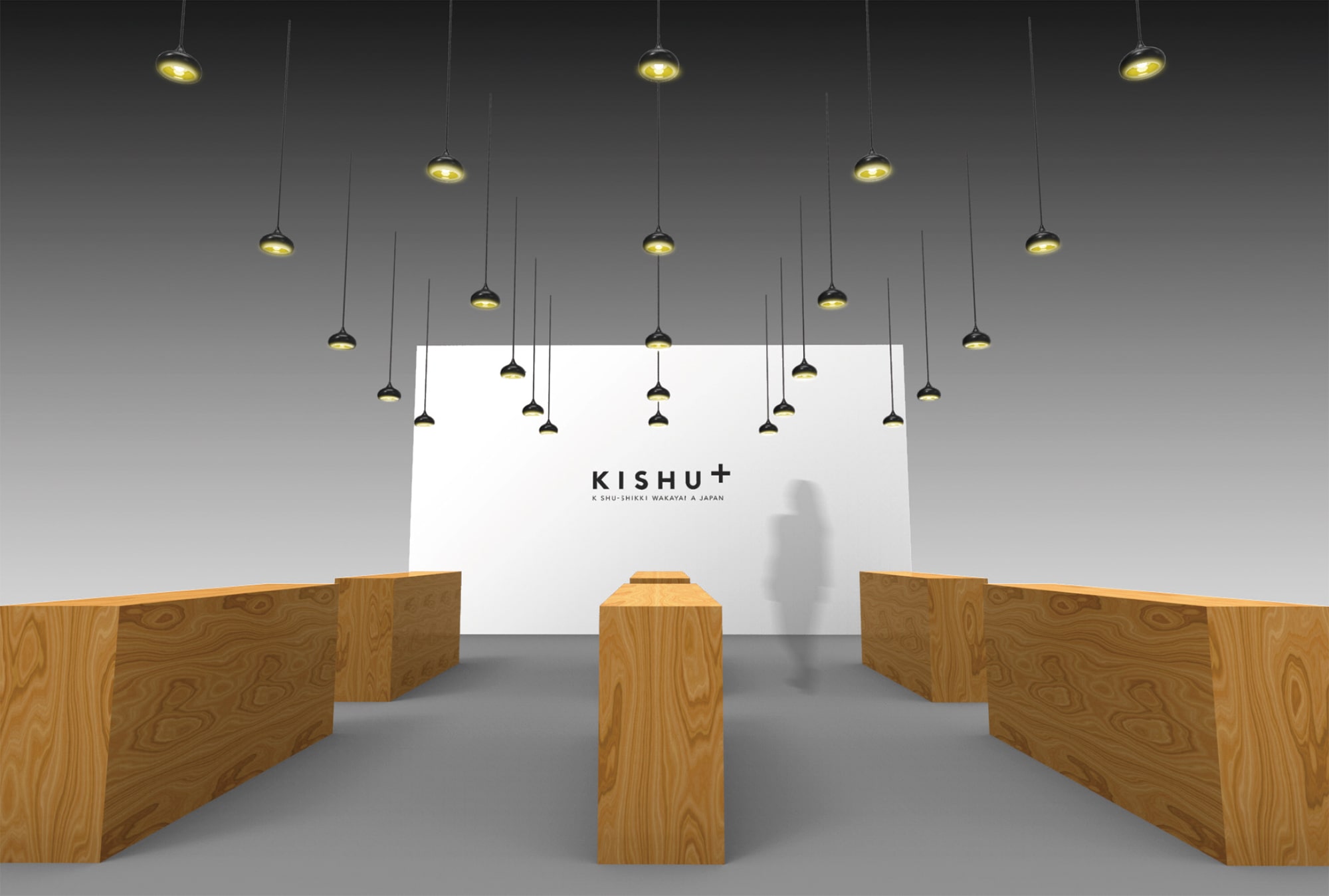
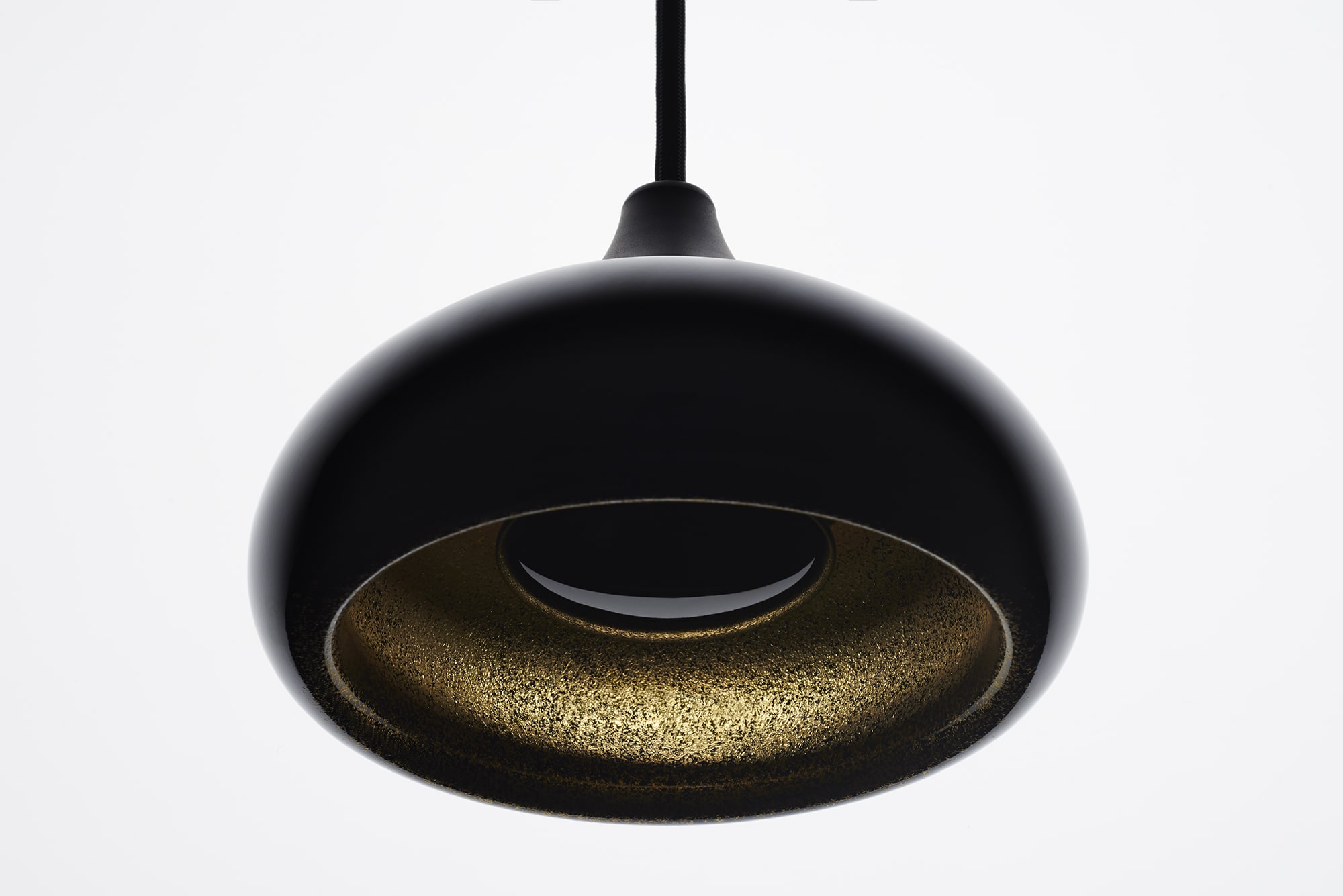
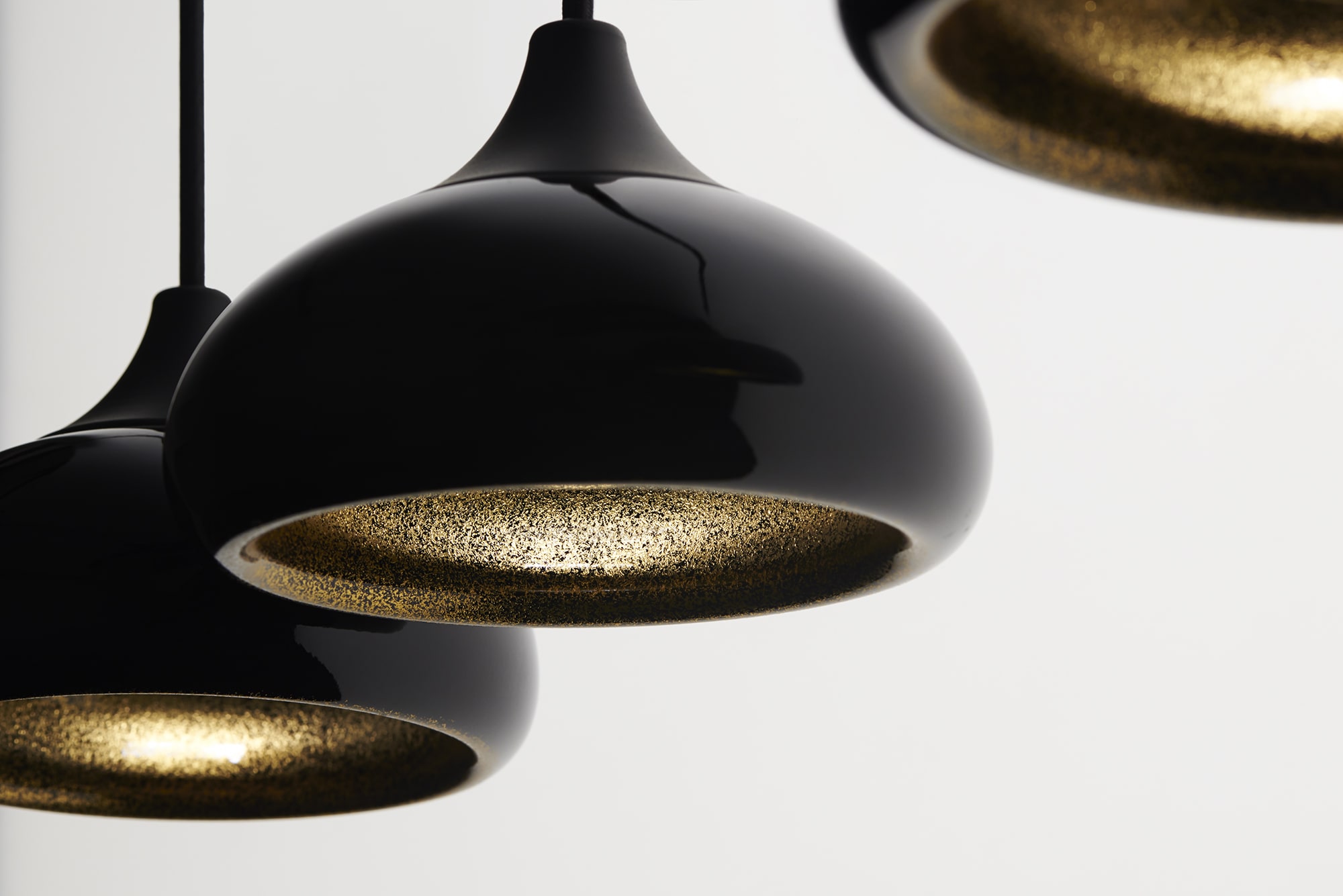
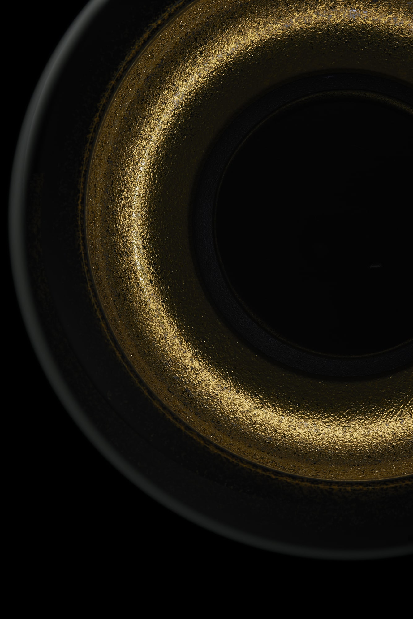
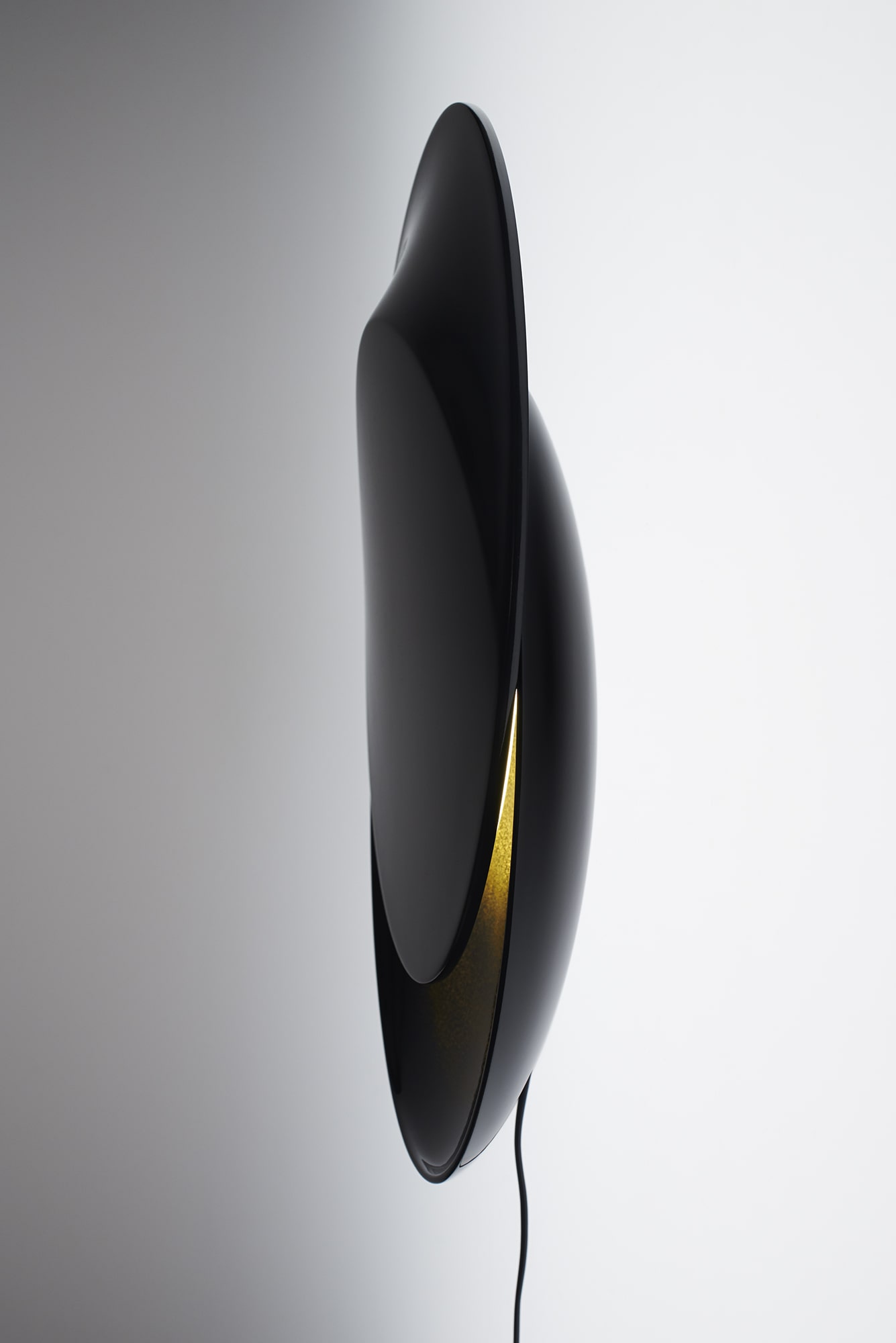
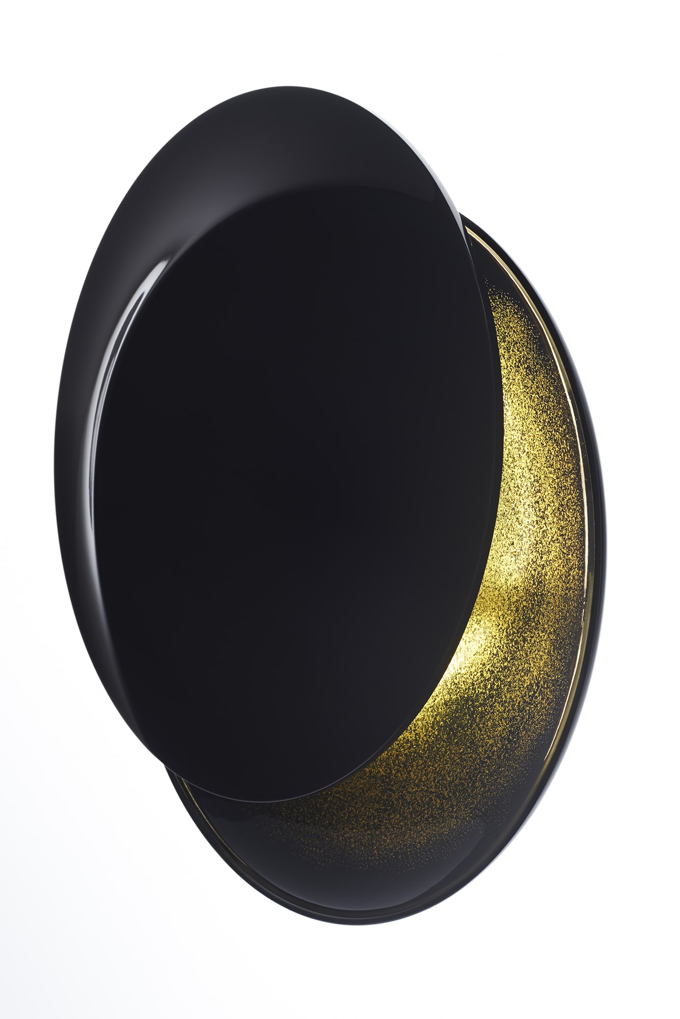
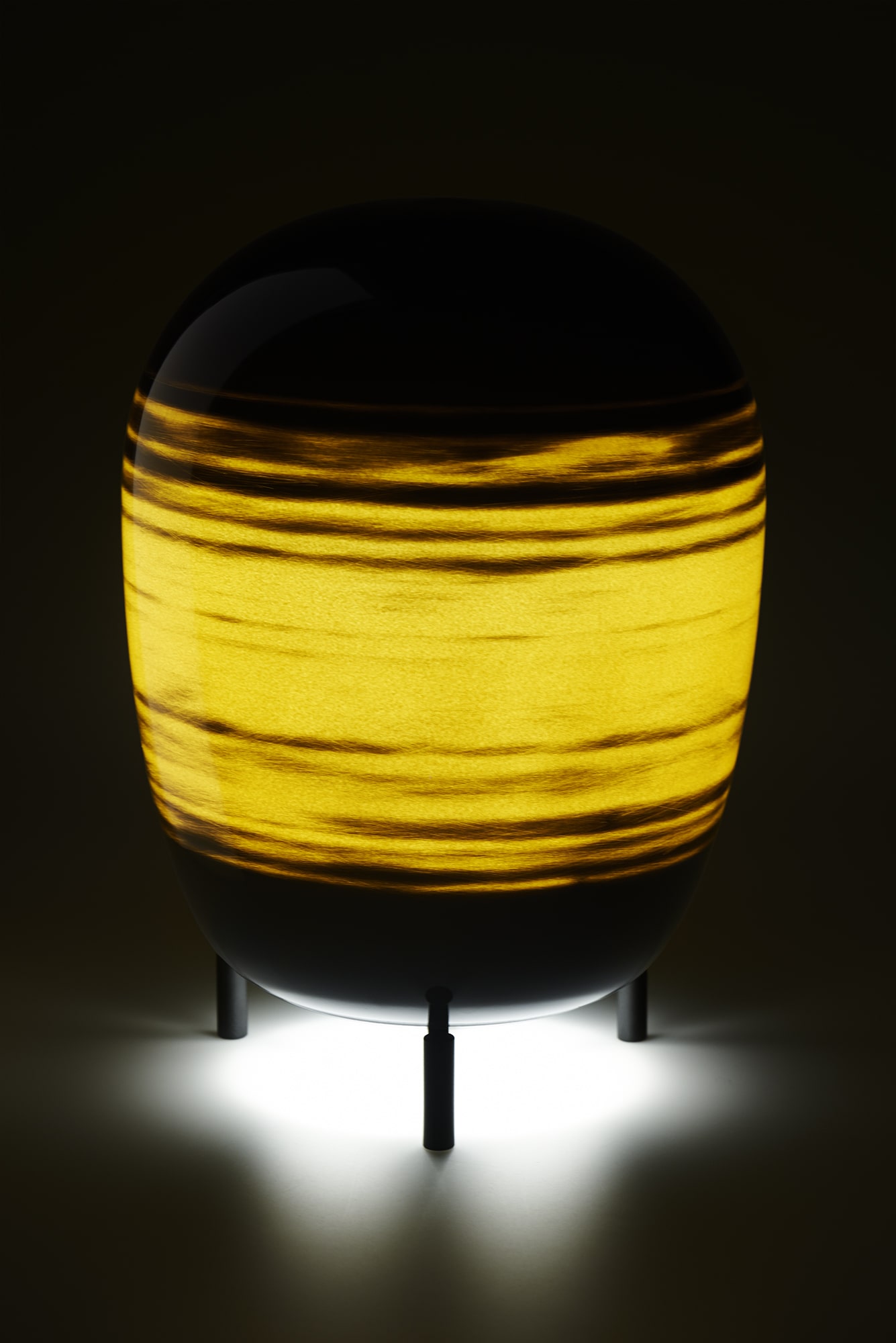
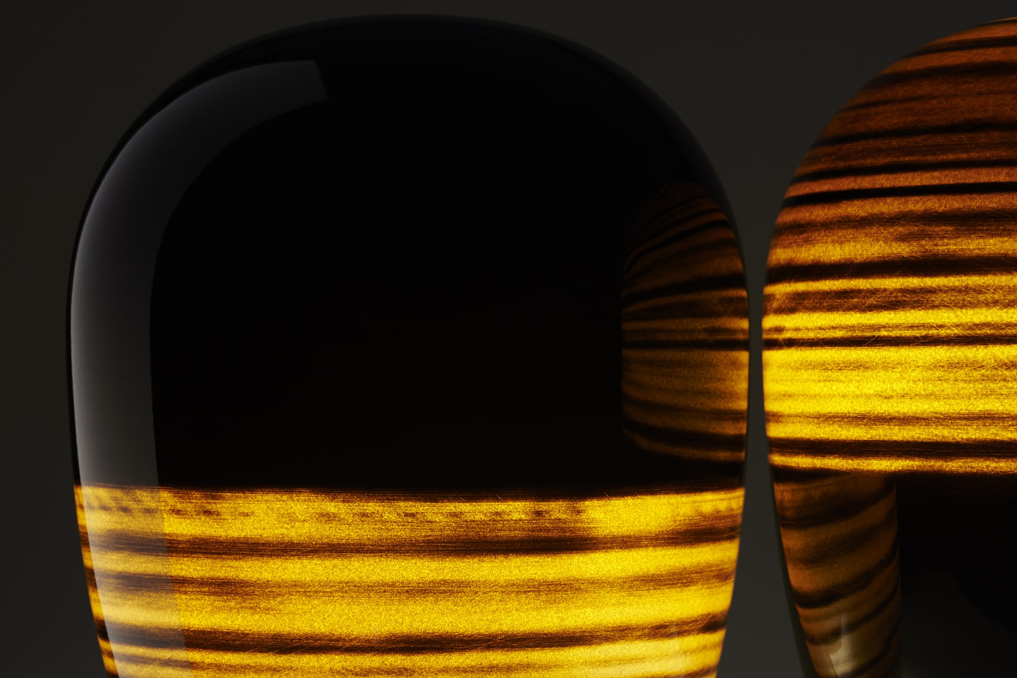
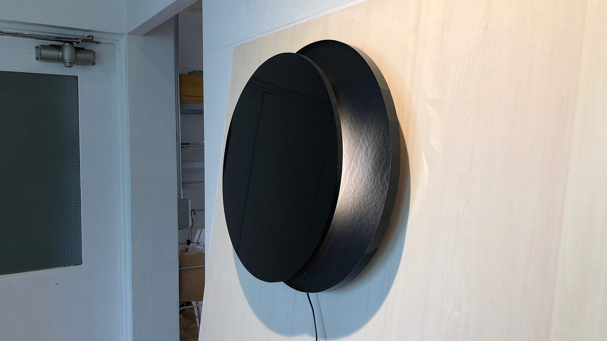
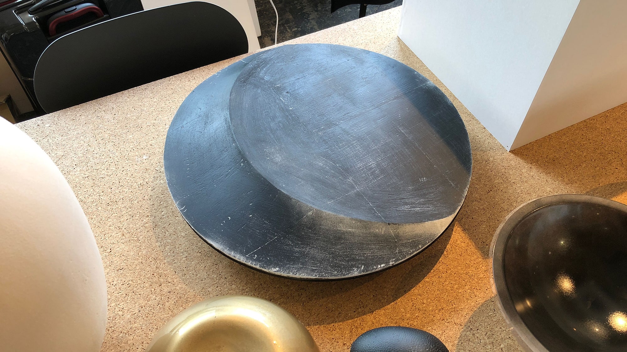
Lacquerware and Shadows
The presence of the shadows further enriches the expressions of light. The Japanese sensitivity perceives the beauty of light in shadows, not in the dazzling light. Lacquerware, which gives off a deep luster as if it envelopes the light, represents Japanese sensitivity to light. We have transformed the beauty of the shadows of lacquerware into lighting. It does not give light to space, but it is lighting to create the shadows, that is, the Japanese Akari (=light).
KISHU+ is a new brand of lacquerware, launched by five companies in the Kishu lacquerware production area and overall design direction by TAKT PROJECT. With the sensitivity of lacquerware to shadows, lighting products have been designed as the second product series.