-
DATA
2018/09
-
CLIENT
-
PROJECT NAME
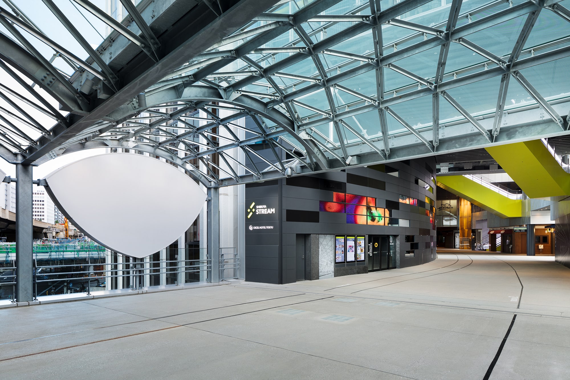
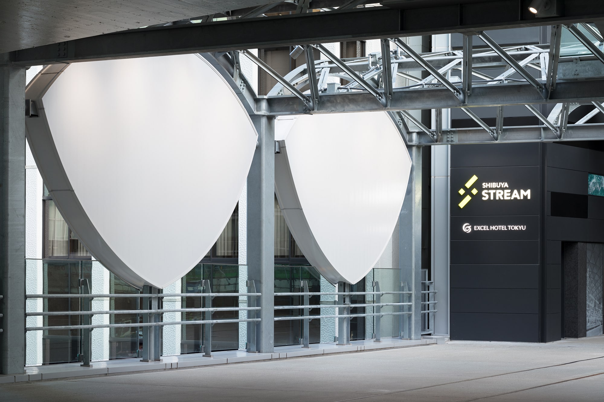
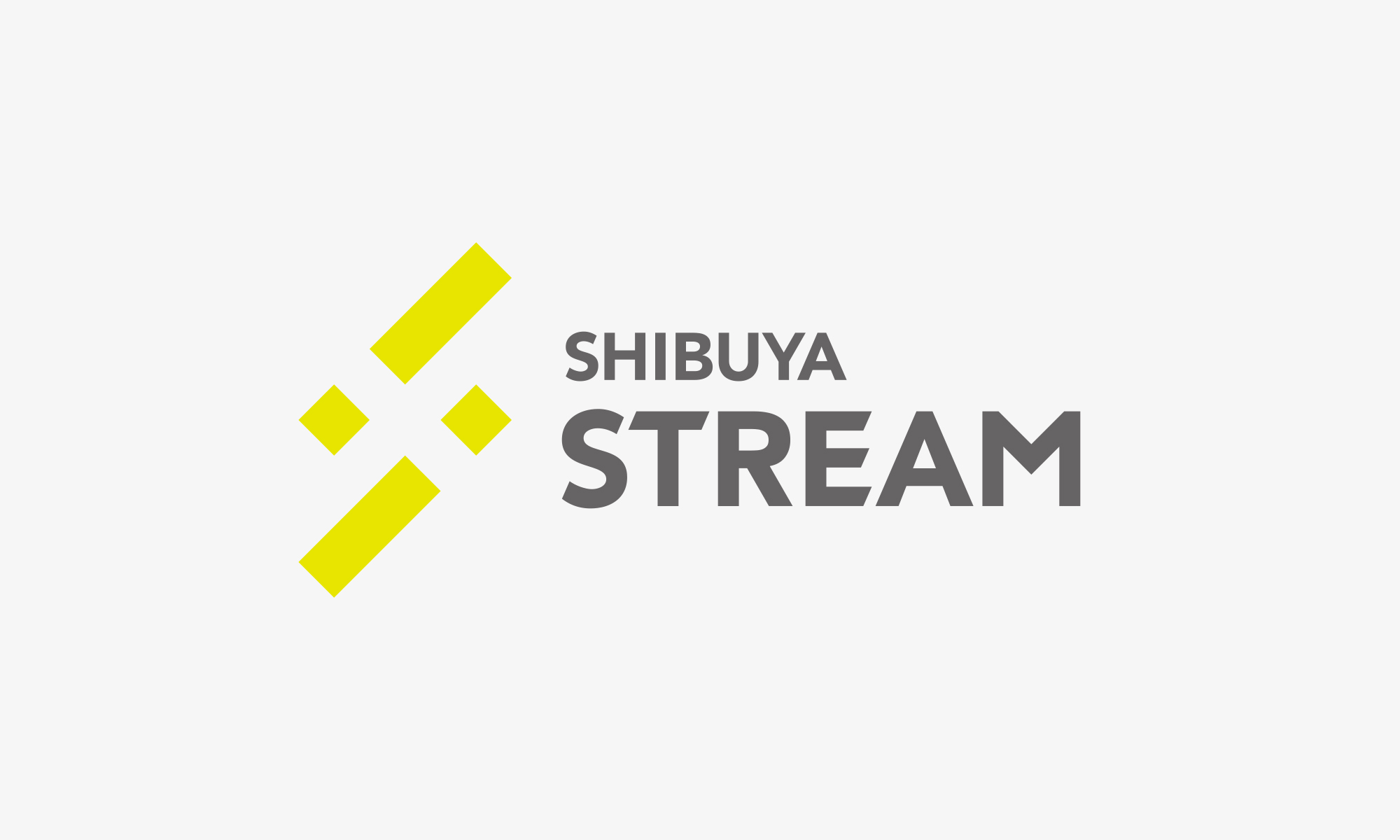
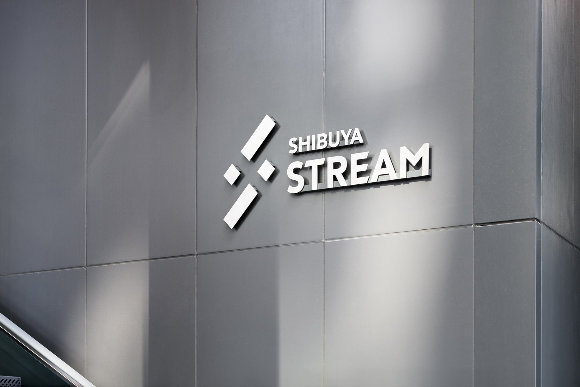
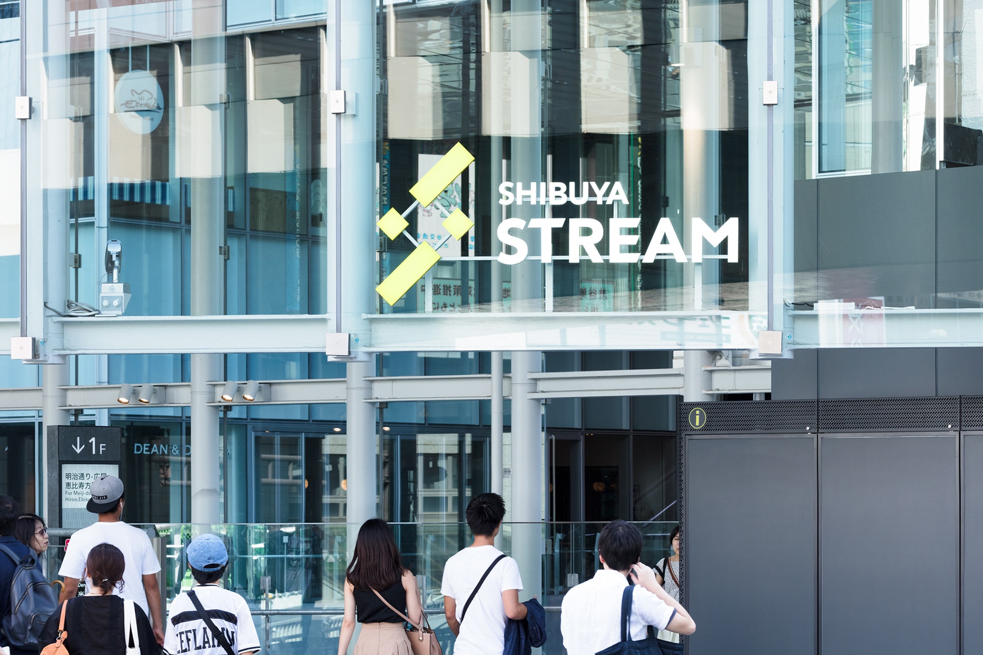
SHIBUYA STREAM
VISUAL IDENTITY DESIGN
TAKT PROJECT
ENVIRONMENTAL FOOTAGE
SOUND CREATION
LIGHTING DESIGN
Izumi Okayasu Lighting Design Office
PHOTO
Collaborate
Shape Born from Meaning, Movement Born from Meaning.
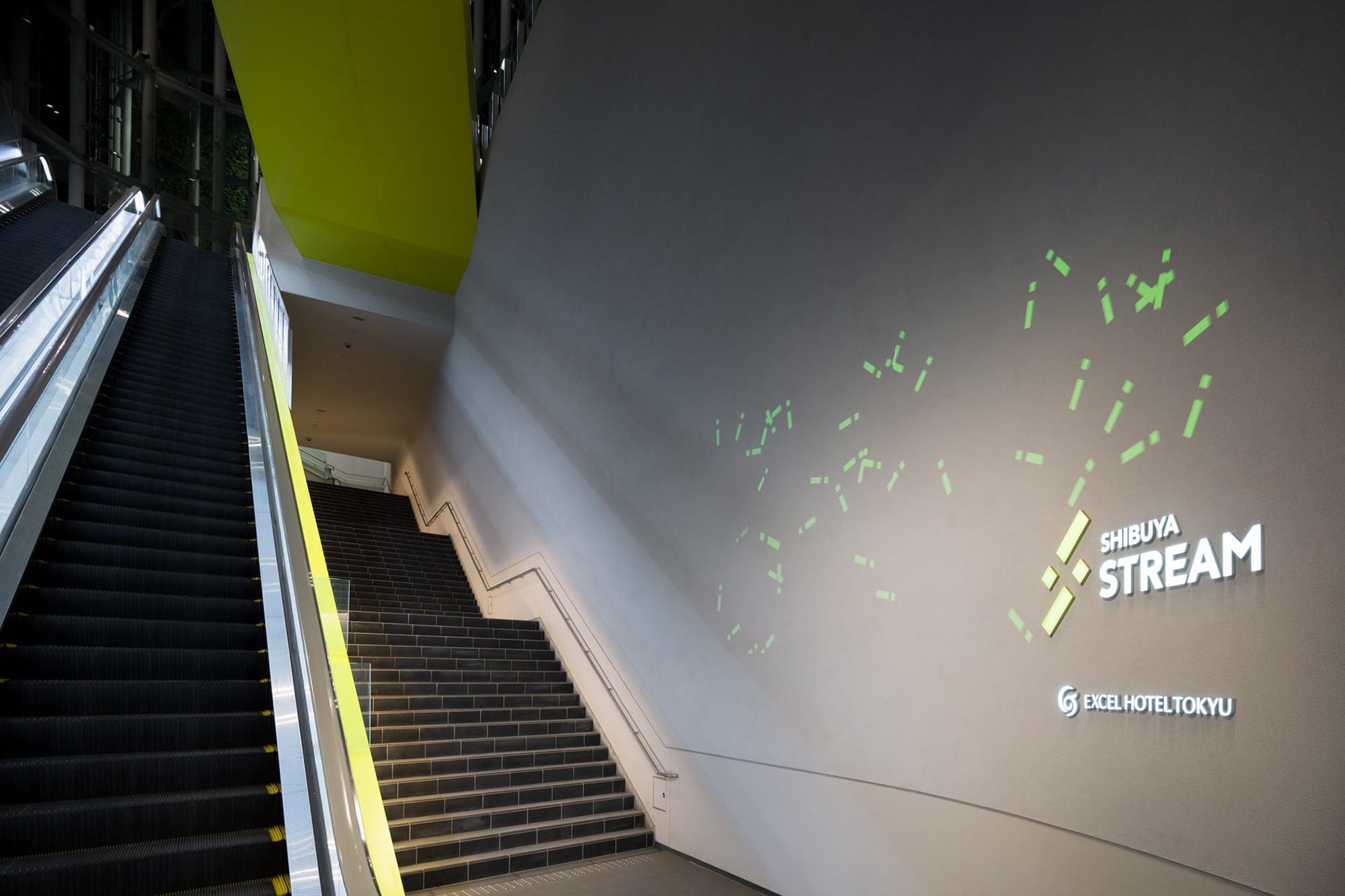
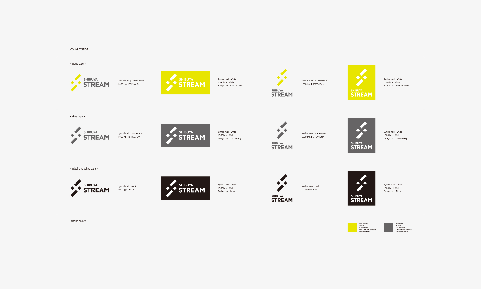
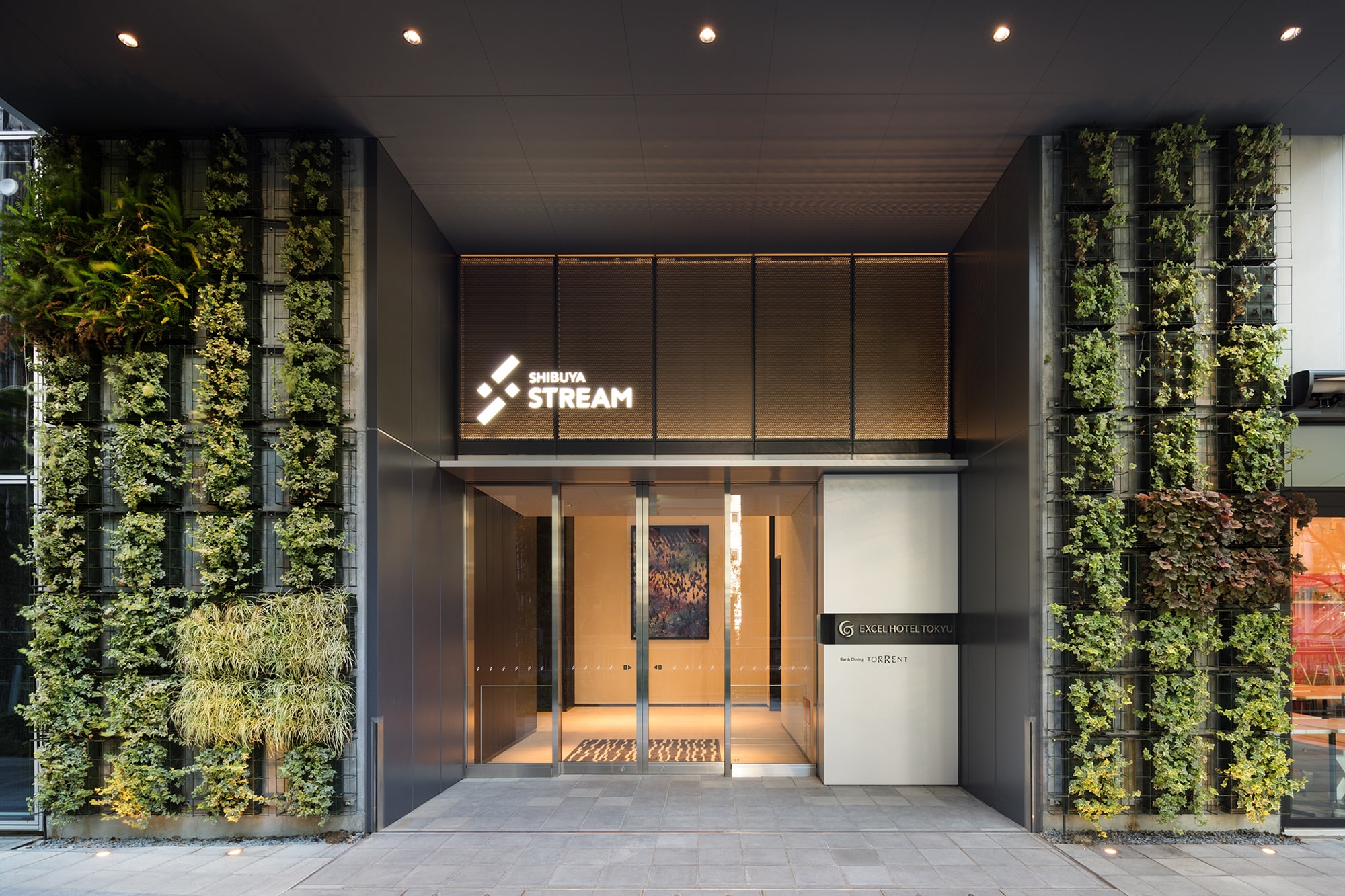
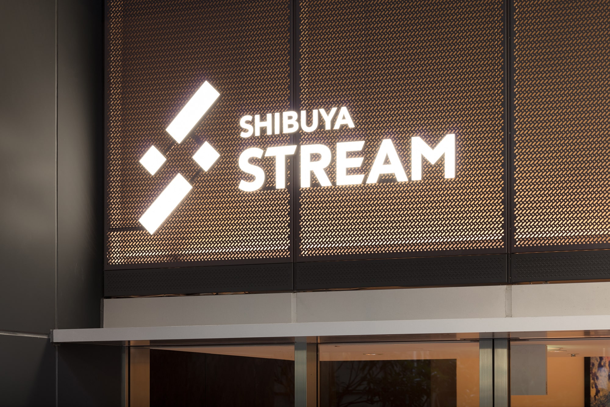
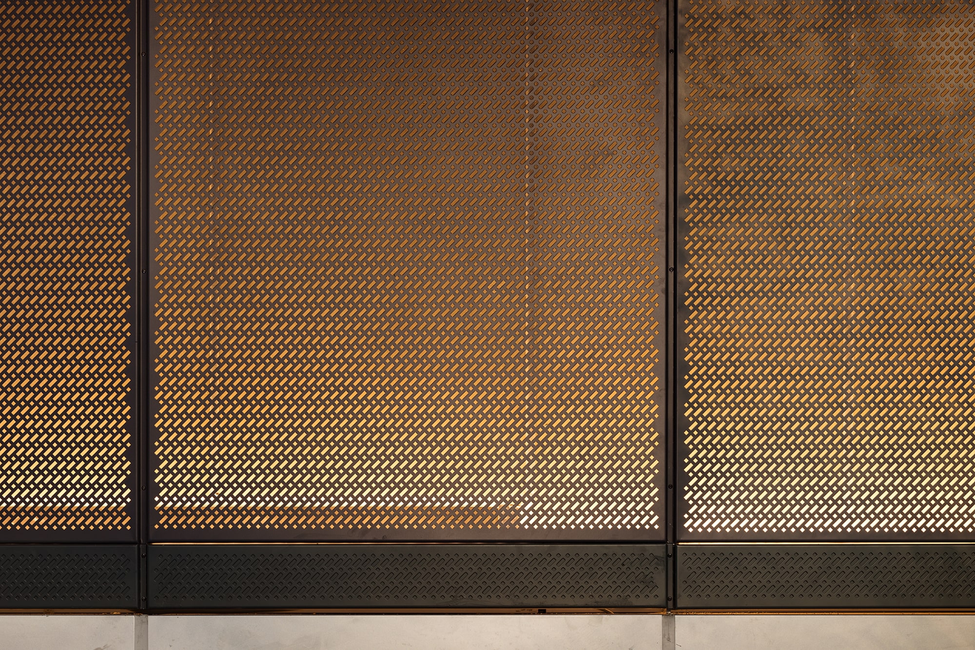
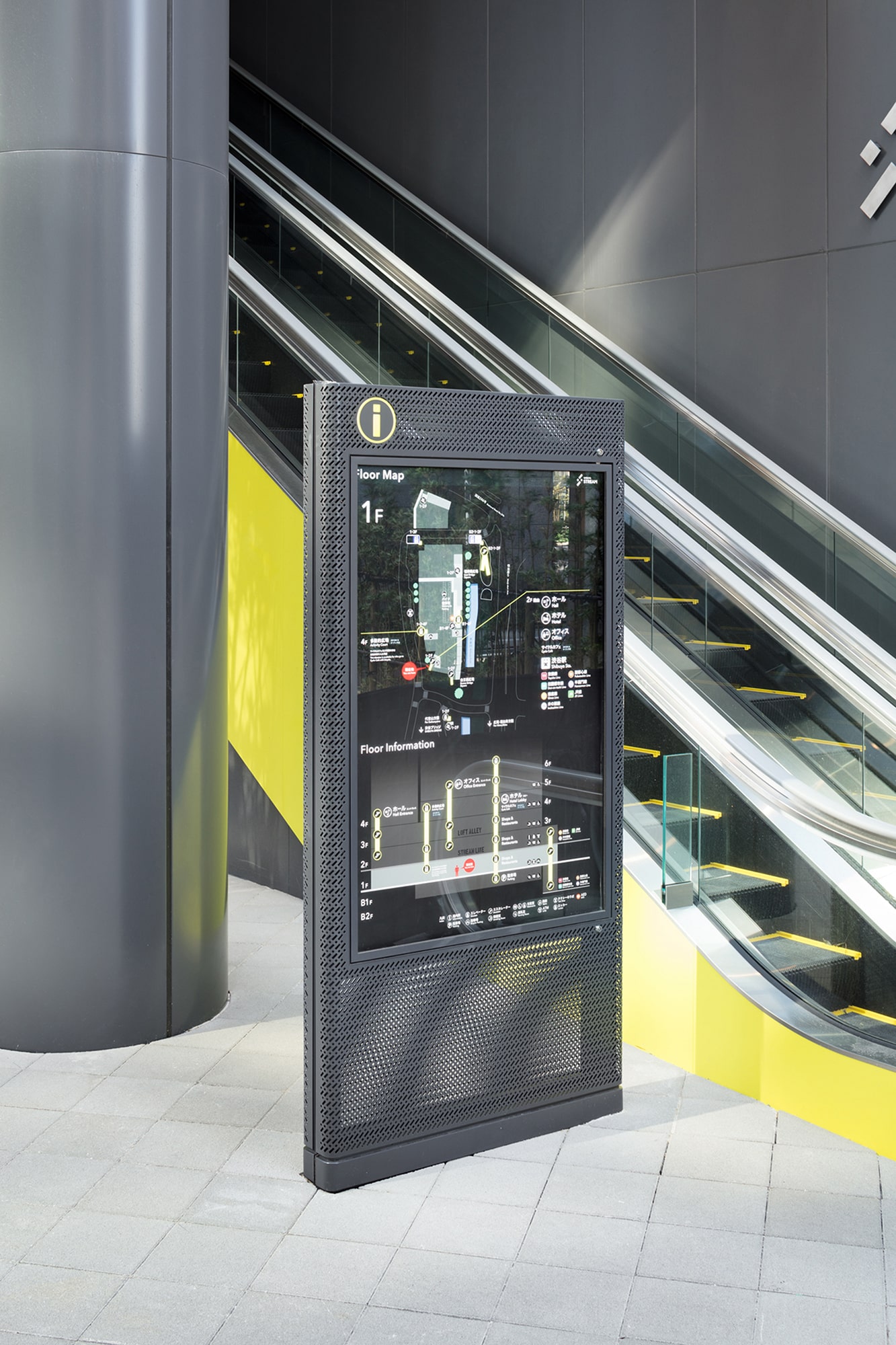
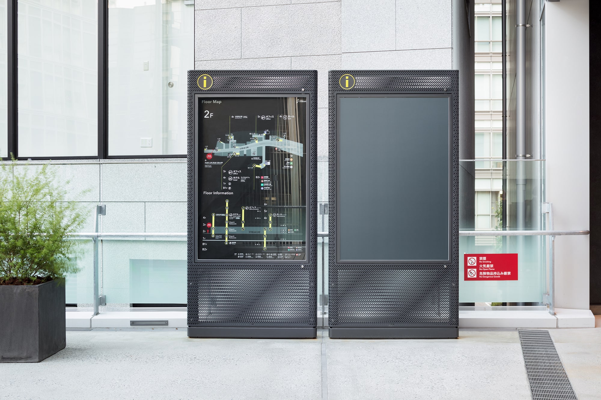
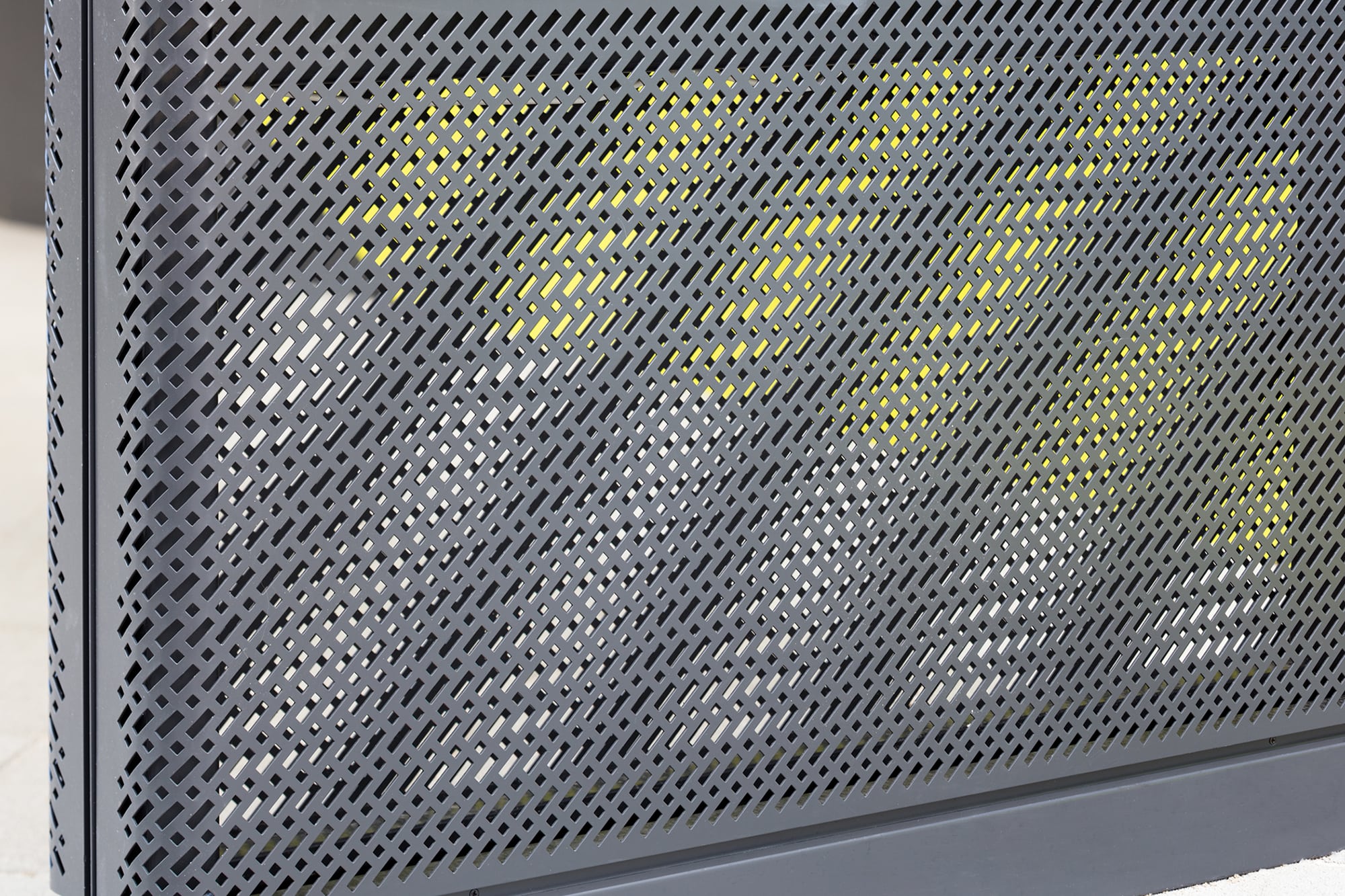
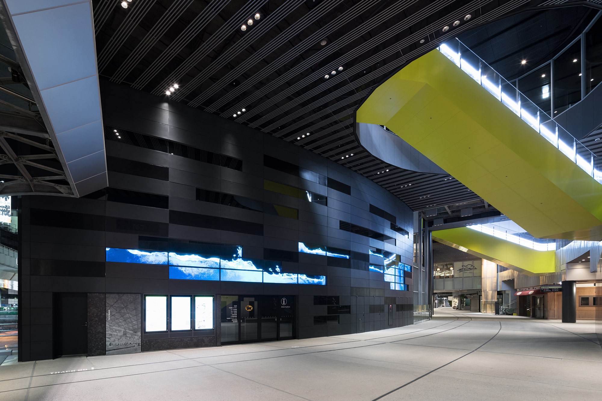
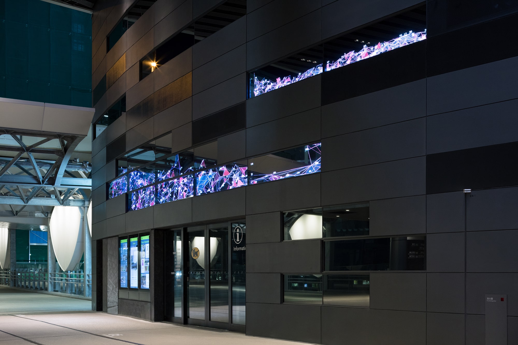
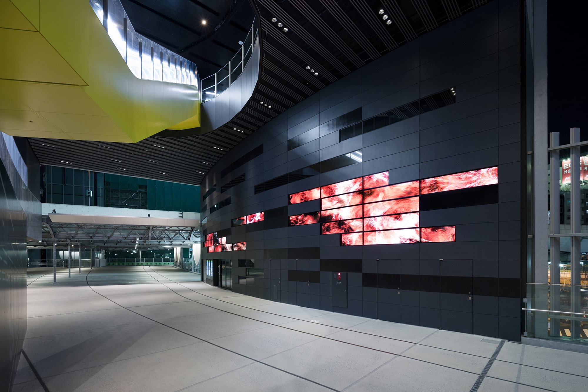
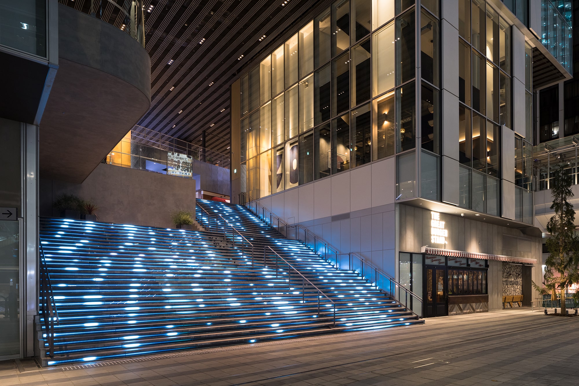
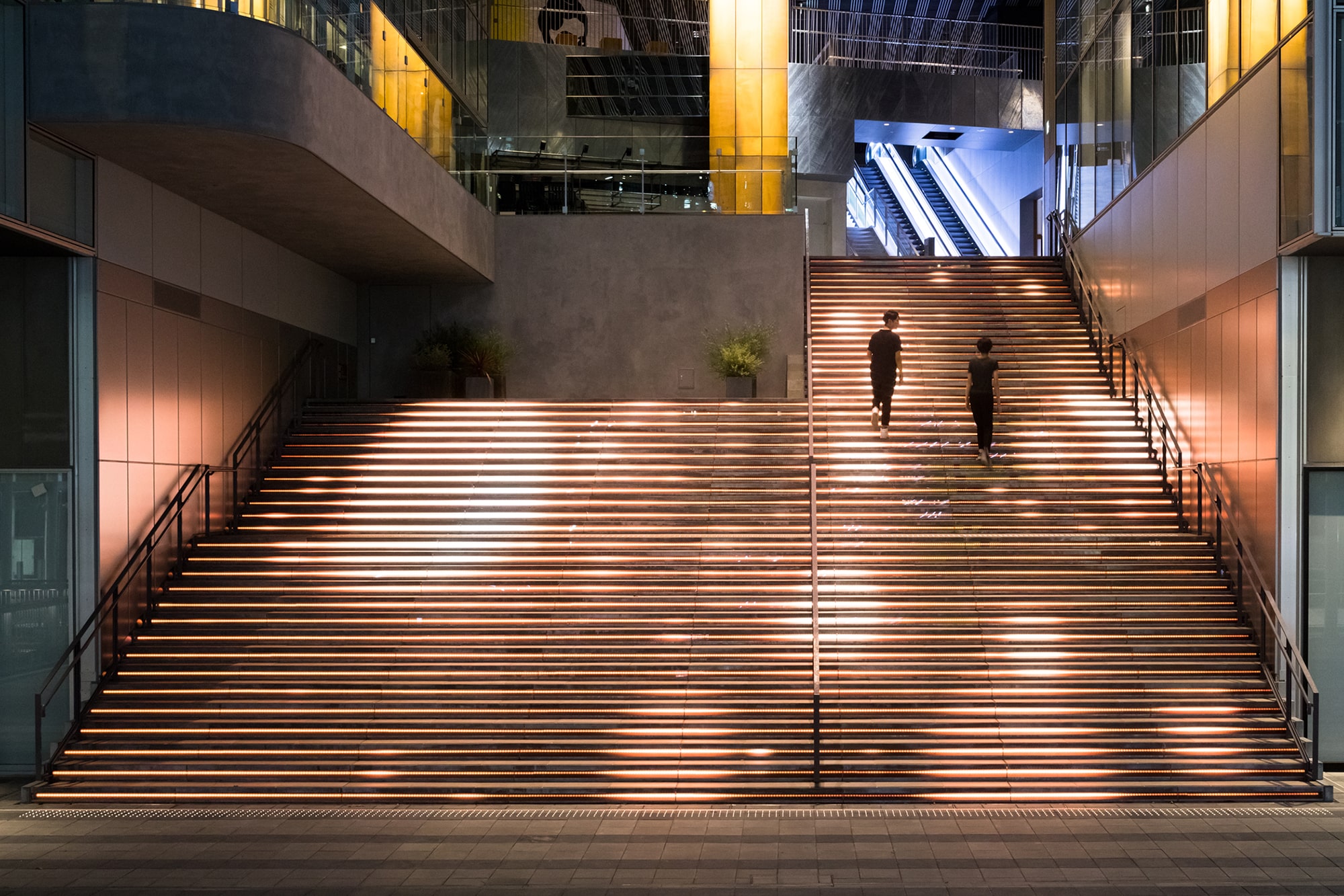
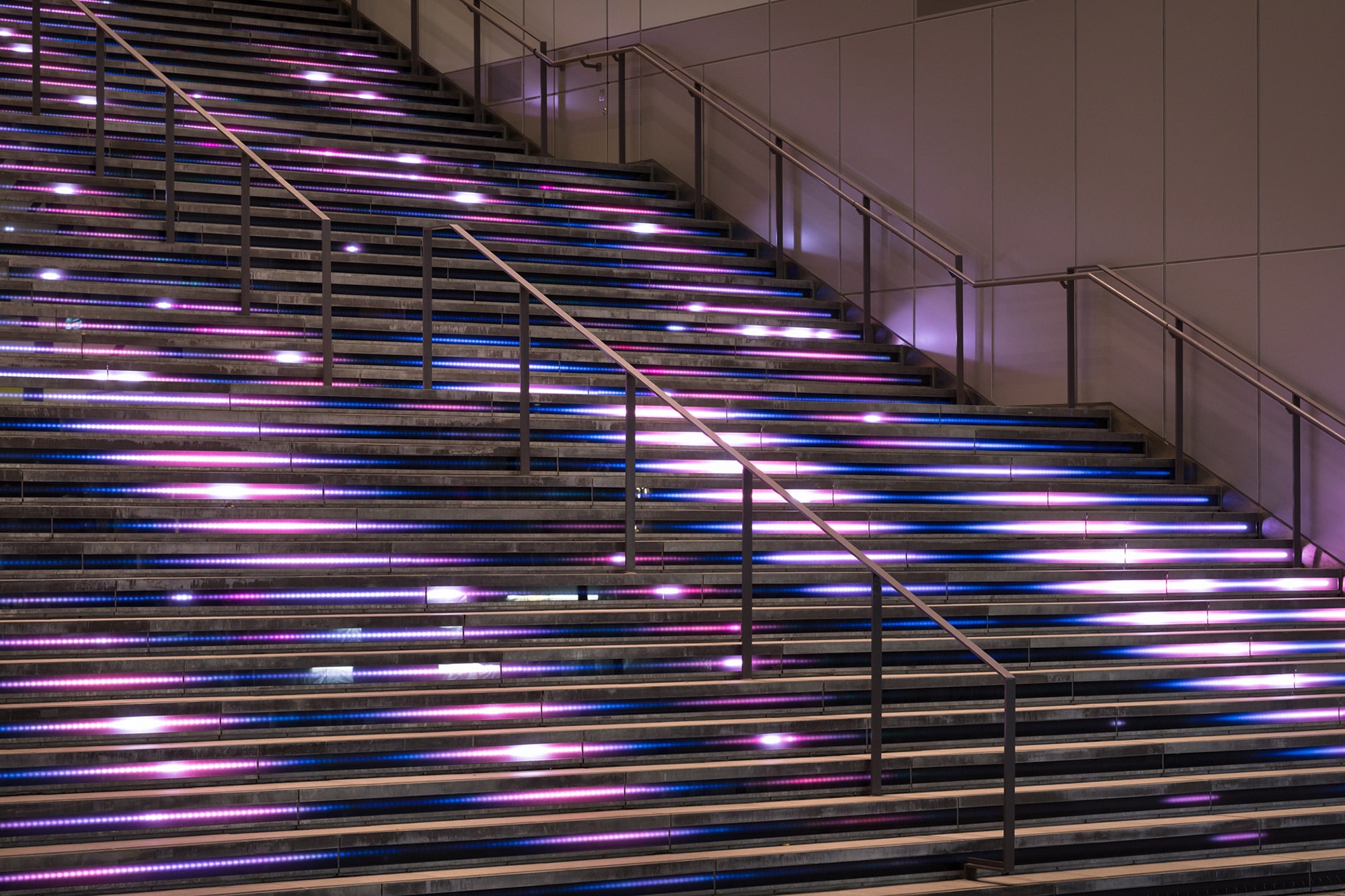
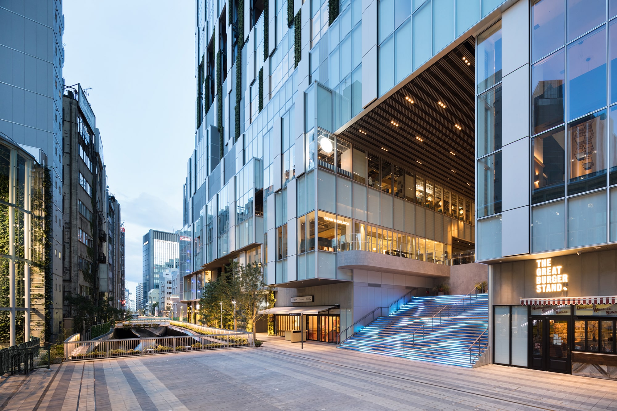
SHIBUYA STREAM is a large-scale complex facility, built as a result of redevelopment of the former platform and railroad tracks of the Toyoko Line at Shibuya Station. TAKT PROJECT designed the visual identity (VI) of the facility including the logo. We were also in charge of environmental designs of symbolic physical components of the facility: the large video-projection wall in the connecting passage between the facility and the surrounding city, and the grand staircase that leads from the connecting passage to the Shibuya River. The facility was named SHIBUYA STREAM to represent Tokyu Railways’s desire to continue creating trends for the next generation as a “holy ground for creative workers” where various people and ideas intersect. In order to embody this desire, we designed the logo by integrating two meanings: the moment when an “idea=!” that symbolizes creativity emerges from a “person=i,” and the moment when an idea “!” intersects another idea “!.”
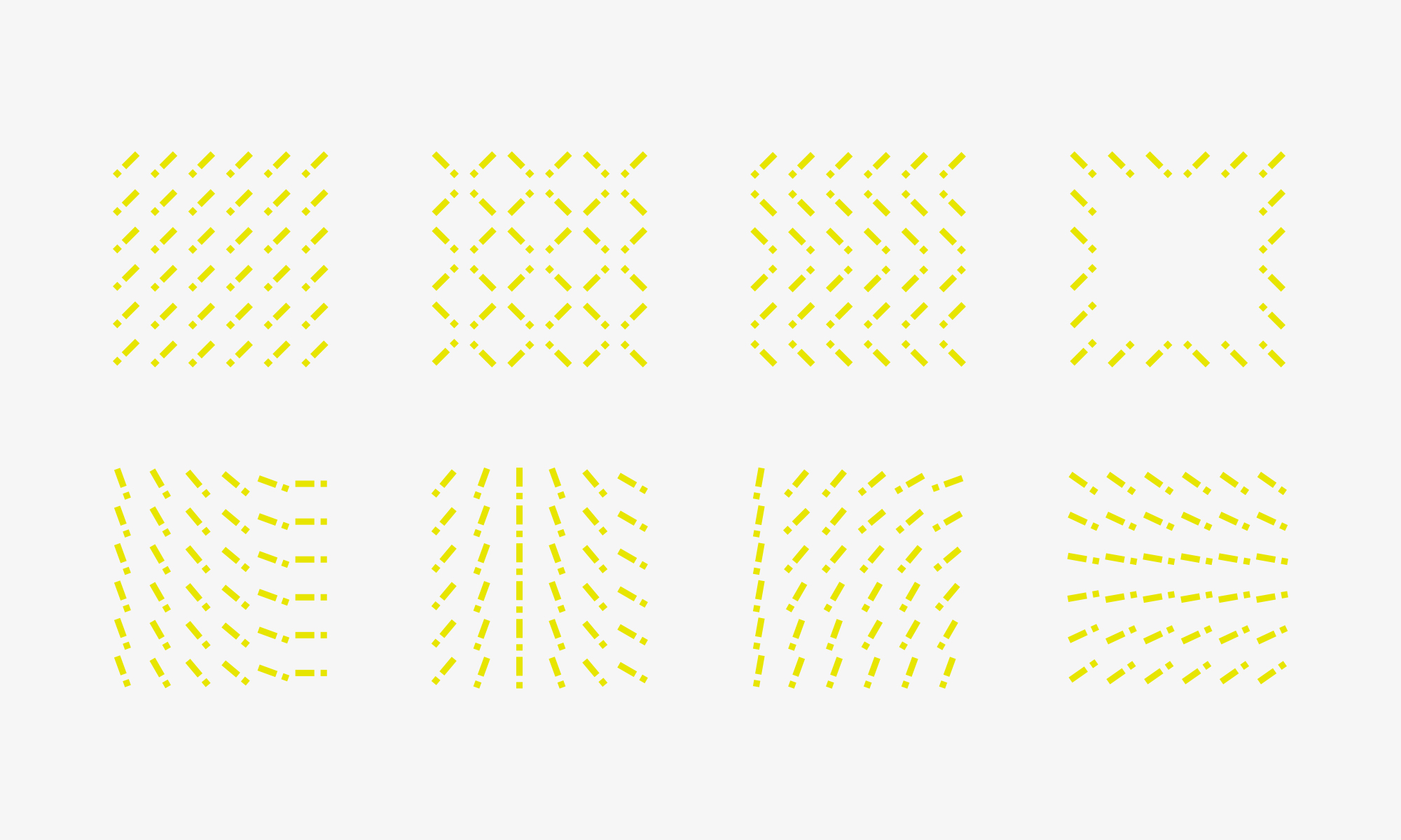
With a hidden cross shape between the “!” and “!,” this simple-looking logo is full of complex meanings. Furthermore, since it is possible to express a stream by using a number of “!” just like a fluid, it is utilized throughout the facility including communication movies and signage. As a dynamic visual identity, it will function as a symbol to welcome visitors with a lively flow.